


MotoGP website redesigned for 2015
As a web developer I've always found it interesting to dissect websites to see how they work from both a technical point of view and from a design/UX approach. I first took an interest in web design/development at the age of 12 and I would view the HTML source of websites that I liked to try and learn how they worked and I still do this on a regular basis. I'm also a massive motorcycle racing fan so naturally when MotoGP.com relaunched their site in time for the 2015 season I was excited to see how they've approached it.
The website has been long overdue for a redesign, I can sympathise with how large of an undertaking it is to rebuild a site of it's size. Their video and image libraries go back to the early 90s, the site is translated into 7 languages and their traffic would be delivered in tsunami like waves during the 18 race weekends per year.
The most obvious change is that the site is now fully responsive running on Bootstrap. I don't even need to stress how fundamental this is for any website today.
The new site has been designed heavily around embracing social media. For years now all the riders have had official twitter and Instagram profiles which have massive follower bases. I find the social pages are often far more interesting than the official press releases on the motogp website. Rather than losing the traffic to social media they have made the best of it by seamlessly mixing in the twitter and instagram posts from the riders and teams amongst the regular content in a Pinterest style layout. I think it works incredibly well and can find myself scrolling through content forever where as previously there would only be a handful of new articles per day outside of a race weekend. So now I find myself checking the site daily rather than once or twice a week as I did previously.
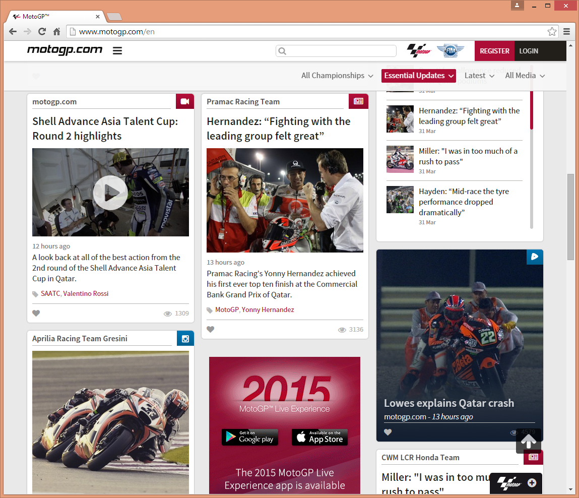
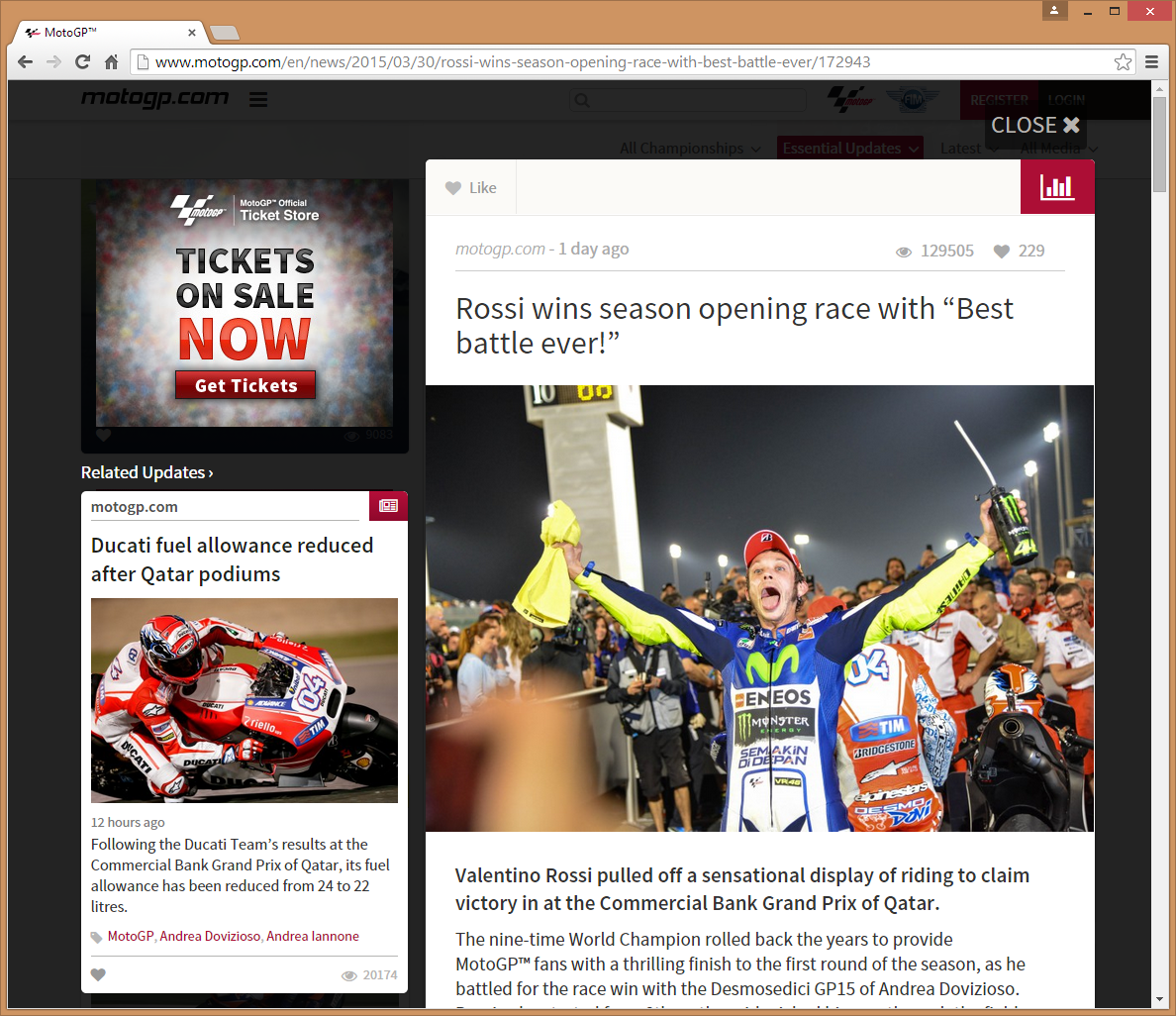
With the new proven infinite scrolling approach to the home page they've also designed the content to pop-up over the top of the feed in situ so that you can view full content without requiring opening multiple tabs (suicide on mobile) or losing your place in the feed from navigating back and forward. This is nothing unique but it's more commonly seen on SOA's.
All the other areas of the site have had a lick of paint as well, the video and image galleries are far more user friendly. Previously in these sections you felt like you were stranded on the first page of most recent content and it was awkward to try and discover content. The new design has many more categories and offers ways to discover content without having to specifically search for a tag.


