


Measuring Customer Retention in Google Analytics
One of the greatest benefits of operating an online business is the ease with which we can gather data and measure our success. But success isn't one dimensional. Measuring total visitor fluctuations, conversion statistics, click through rates and average time spent on site is simple these days. Customer acquisition, a key metric for marketers, is also child's play to track thanks to today’s analytics tools. But what about customer retention?
It’s common knowledge that the cost of acquiring new customers is often ten-fold that of keeping existing ones.
Yet, despite their importance, I find that many businesses are unaware of how easy changes in retention and attrition rates are to measure and act on.
Enter Cohort Analysis reports
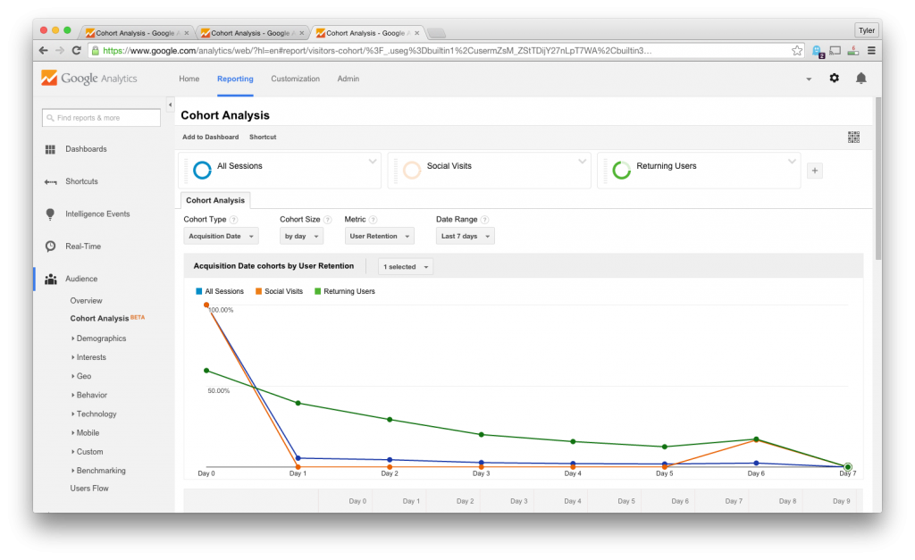
Google Analytics now has a report that easily separates visitors out into groups, or cohorts, based on the date that they first interacted with the site (the assumed date of acquisition). It then neatly charts out the number of customers within that cohort who return on subsequent days.
This gives us an immediate visual representation of how engaged new visitors are after their initial interaction. But the real power lies in the ability to compare cohorts to one another.
Say, you use a SaaS business model and decide to make some changes to your onboarding process. How do you know if the changes made are driving the expected increase in engagement? Simply compare two cohorts, one group who first interacted under the old process, and one under the new.
Out of the box this report relies solely on return user data. That is, it considers only that the user came back, not what they did upon return. This might be ok in some cases but I find it more useful to use the “Goal Completions per User metric” which plots only those who completed one or more conversion funnels.
You can also apply segments to further refine the reports and compare multiple channels and entry points. Pretty neat!
There are some obvious limitations though, and this is understandable given the reports are still flagged as “beta”:
- Currently you can only chart the total goals completed. There is no ability to specify a particular goal.
- Only 4 cohorts can be compared at any given time

