


It's the small details that count
You have a website and you work hard to attract visitors. You have focused on optimizing the site for search engines, written a hundred blogs and use social networks for promotion all while ensuring that you have quality content on your site. You have found that you get visitors to the site easily enough, but once they leave the opportunity is over and you will have to work harder to get other new visitors. A lot of the reasoning behind this can come down to the user having a poor experience navigating your site and finding it difficult to use. And if that is the case, why would they return? Particularly when it comes to shopping for clothing online which can commonly be located across a number of competitors websites.
Anyone who knows me is aware of the fact that I buy more clothing and footwear than I probably need. As a result of this, I’m very conscious of the varying ways to make my dollar go further when shopping for just about anything. The best way of doing this is to shop online obviously, however it can actually be quite difficult to buy clothing online as there are so many variables to consider. The most problematic of these tends to be sizing, but it doesn’t stop there. Depending on the quality of the photography used by the online store, you might just pick out that perfect red shirt only to realise when it arrives that it is in fact pink!
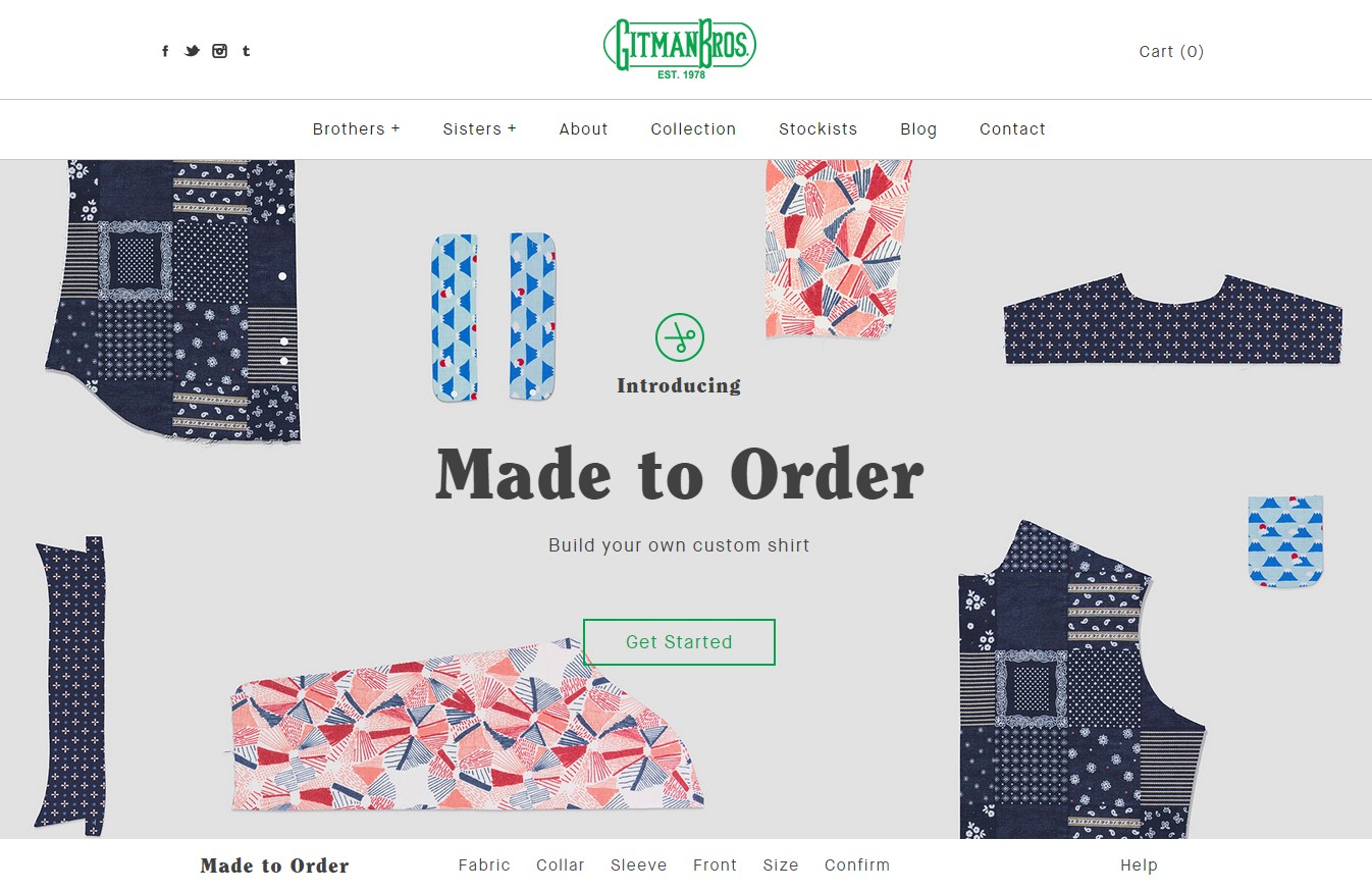
There are many online stores who do it right and others who struggle and I’ve seen them both to varying degrees. However it’s those who have a niche or point of difference and focus on the user experience that stand apart from the crowd. They are the ones who will reap the rewards long term and find that they have recurring visitors. One of those is a favourite label of mine called Gitman Bros. Vintage. GBV as they’re commonly known, have recently launched a new ‘made to order’ site which allows customers to make some adjustments to the typical sizes available by purchasing through their online store or via one of their many online stockists. For someone like myself who tends to modify all of my shirts, this is a great idea.
Looking at the site, I can’t help but be a little critical about the user experience.
Upon arriving at the site, it’s immediately clear what the purpose of this page is and how I can interact. I can use a configurator to build my own custom shirt, and with some prior knowledge of the brand, I am interested. I click Get Started and we’re off.
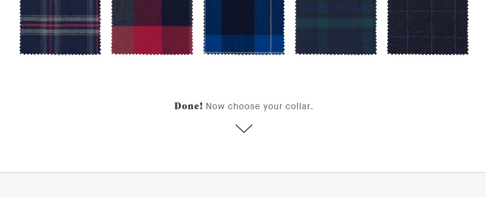
The page animates and scrolls to the next step in the process where I can choose a fabric for my new shirt. There are a large number of fabrics available to choose from, which as a customer is great to see, but all of a sudden I have fallen out of the flow and the content I was viewing is now off page. Had I chosen a fabric on the bottom row, I’d not see any content change at all and be completely unaware of my next step.
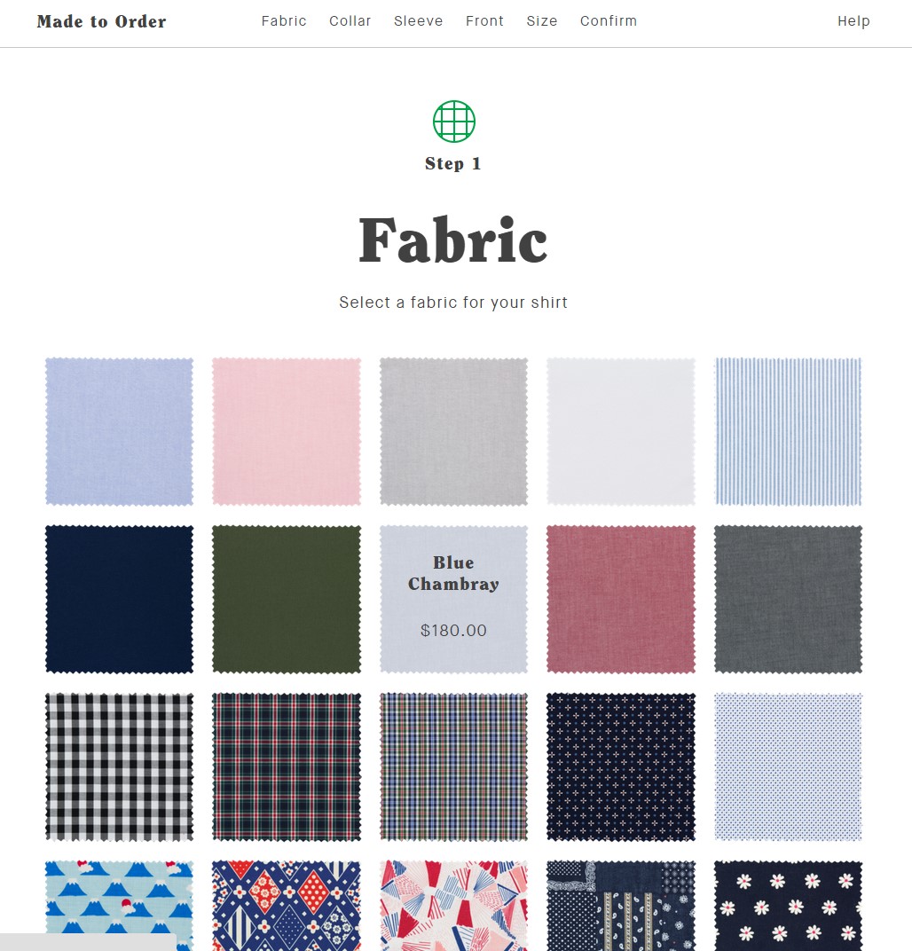
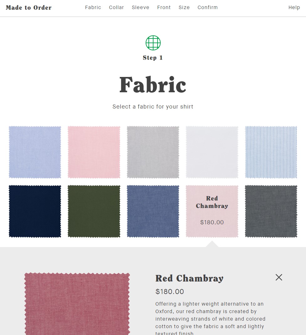
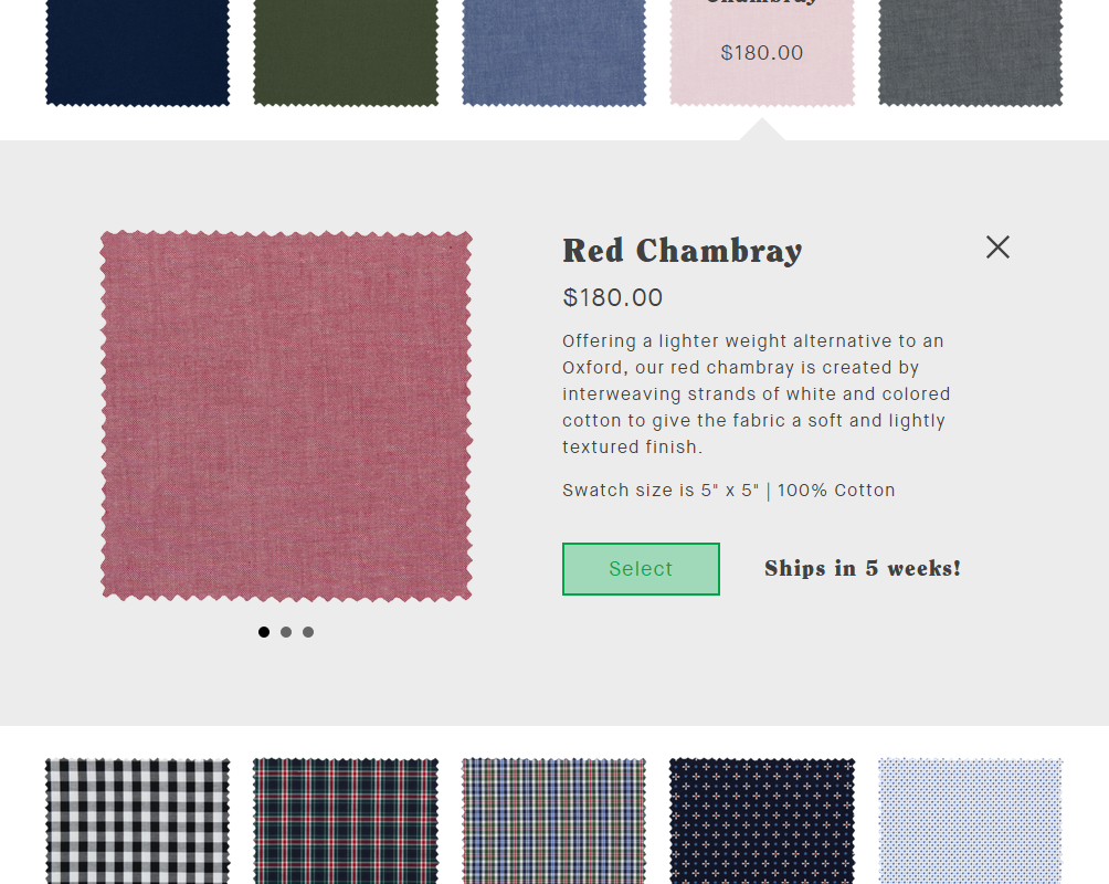
Noticing the expanded element, I centre my page and hit Select to make my fabric choice. The is where process becomes very fiddly. Having hit the select button I am expecting to move to the next step. Instead, I need to hit the close button represented by an X in the corner, which closes the fabric. This does allow me to make a different fabric selection, but breaks the smooth process and I am still unaware of the next step.
Scrolling down I find the button allowing me to move along to the next step in the process.
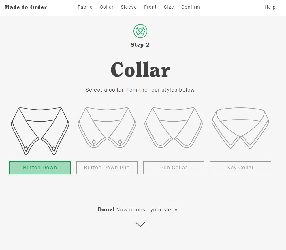
The next 2 steps work as expected and it’s clear that by containing the content above the fold, I am able to easily make my collar and sleeve length selection and move onto the remaining steps in the process.
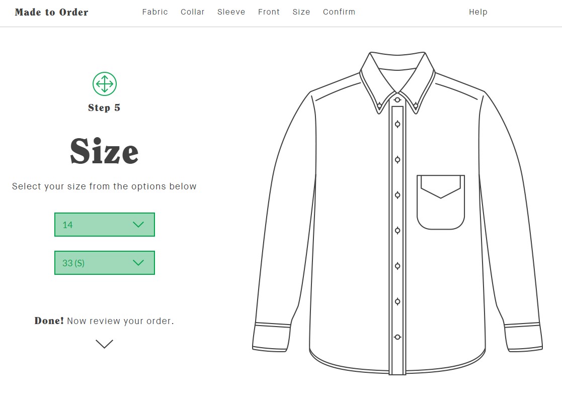
Things become a little more complicated again on Step 5 where the user can choose collar and sleeve sizing. The issue here is the lack of context as the numbers in the selection drop downs do not state whether they are in cm/in. For many this would seem obvious, but it also lacks context for someone like me who owns an existing product, what the small variances in sizing would mean. I’d like to see some additional sizing information for shoulder width and shirt length.
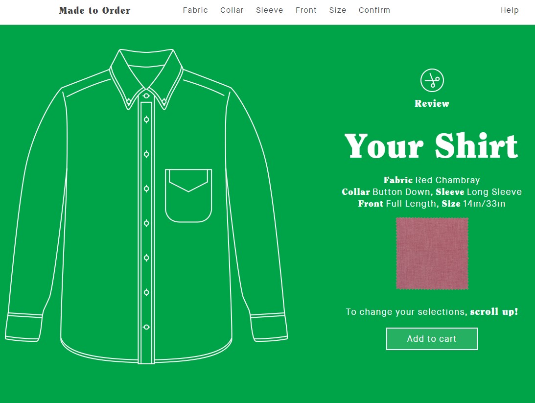
On the confirmation page things begin to make sense again. If I do want to make a change to any part of the process I’ve just been through, can simply click on one of the options at the top of the page which will jump me back to that section. For some reason they ask you to scroll up! which is not necessary. Giving me the ability to simply and easily revisit my previous selections is welcomed and expected.
In all, the site is clean and simple enough to use, even allowing you to work through some of the user experience issues I’ve identified by simply scrolling the page naturally. However I think in this case, the experience could be significantly improved with some minor tweaks and a slight re-think around the fabric selection which could very well lead to increased conversion.
That ‘Red Chambray’ is looking deceptively pink.


