


Responsive the fold
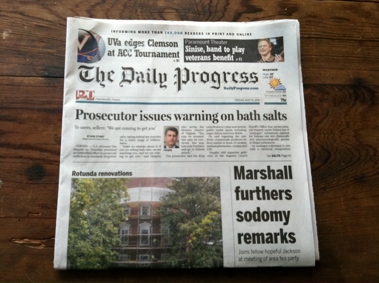
Above the fold is the upper half of the front page of a newspaper where an important news story or photograph is often located. Papers are often displayed to customers folded so that only the top half of the front page is visible. Thus, an item that is "above the fold" may be one that the editors feel will entice people to buy the paper - Wikipedia.
The fold is also used in web development.
“The fold is a term used by webmasters and website owners to mean the portion of your site which can be shown when first entering the site without scrolling down at all. The reason that this is important is that research has shown that the majority of clicks made by a reader of a website are made on that portion which is above the fold. ”
- whereisthefold.com
Few days ago the designer and UI Architecture in our office sat down for the fold again , we found out the new most popular resolution visiting is 1366x768, so after miner the tool bar(s) and the taskbar the fold will is located safely about 650px height. We also investigated the clicks on our clients, almost 85% activities is around the fold area, the clicks make the fold so hot and red. The research will make business think they should make sure the important items should located in the fold. Sometimes result the page looks so packed, not clean and not elegant.
Where is the fold?
A big question for a designer is we always have no idea where’s the fold of visitor’s device, we used to assume all visitors their monitor height is 768px, but the truth is not. Graphic designers know book size and that allow organise the content into an mathematical structure with a proper portion. A responsive fold can help website designer find a proper portion of content area and the image.
 Page proportions 2:3. Margin proportions 1:1:2:3. Text area proportioned in the Golden Section.
Vertical responsive - keep things above the fold
Last year, people notice Apple’s iPhone 5 page doing vertical responsive, that ensure you see the complete slides of phone images, while making it clear that there’s more content below it. Some blogs start to talking about it and it raised the attention for web designers. Vertical responsive is a solution for making sure the important elements located in the fold and adapt the size of website not only horizantally. After one year, we can see more new websites doing vertical responsive. But very ironic, the new iPhone 5S page is not doing the fold thing anymore, the main slides has been cut off on my 1600x900 Samsung laptop, and the content is below the fold.
To achieve vertical responsive just only need few lines of codes. Javascript can detect the height of the browser then adjust the container height, in the container the CSS position the elements, that’s just one of methods. There’s always heaps tutorial on the internet.
Thus we don’t really have to stick to the 600px (or 650px?) We can adapt to the device by the height.
Will people scroll?
The concept of "above the fold" is important concept but not in the same way as previously thought. People scrolls or wipe their device a lot for no reason, that’s my everyday scene on the train and bus, people now scan through the website more than before. And scroll can be a fun thing! Website is not static anymore, they’re interacting a lot in recent years. Provide a scroll to top button will be a friendly touch.
What should be in the fold?
Only things are crucial, we don’t have to cram every element which you think is important in a limited space, make it clearly telling visitor who you are, what are you offering ? and why they should stay and hang out with you? Try to entice them in the first impression, just like the social human do, we make website for people, their psychology is a subtle thing.
If you’ve keep their attention, they would more likely stay with you and scroll down for further details, tell them your story chapter by chapter, plan it well, and they’re in your hand now. That’s how I engaged with Rdio , I was just thinking they looks better than spotify. Their real call to action located in the very bottom of page, sign up now! very dangerous.
(but unfortunately I broke up with Rdio in June, I found this guy’s music sounds no different to grooveshark …)
It’s not a rule or standard
The concept of Above the fold is still important, but it doesn't mean we have to obey the rule all the time and cram your page.
Make some priorities, responsive the fold.


