


Responsive in the wild
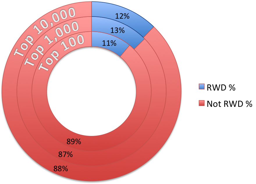
Responsive Web Design (RWD) has been used successfully in many projects at Wiliam. So I was surprised when Guy Podjarny revealed during his presentation at Web Directions last week that only 11% of the Top 100 websites use RWD. That's meant that roughly only 1 in 8 website are responsive. Most of us make or evaluate a RWD site primarily from a design perspective, without concern for performance. Podjarny used the conference's Webdirections' website as an example of “badly implemented” RWD in terms of request and page load – the website didnt seem to be optimised, mainly due to the fact that the image size loads 5.8x times more byte per pixel on mobile. Funny, right?
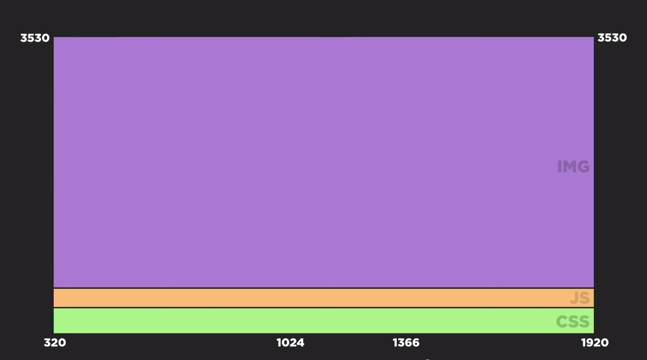
This is probably similar to what the conference's website looked like.
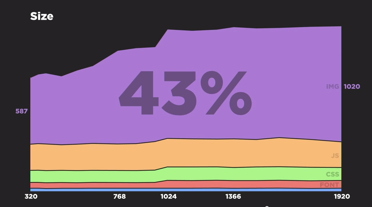
Ideally, a well implemented RWD site should look like this. Image optimizing is crucial:
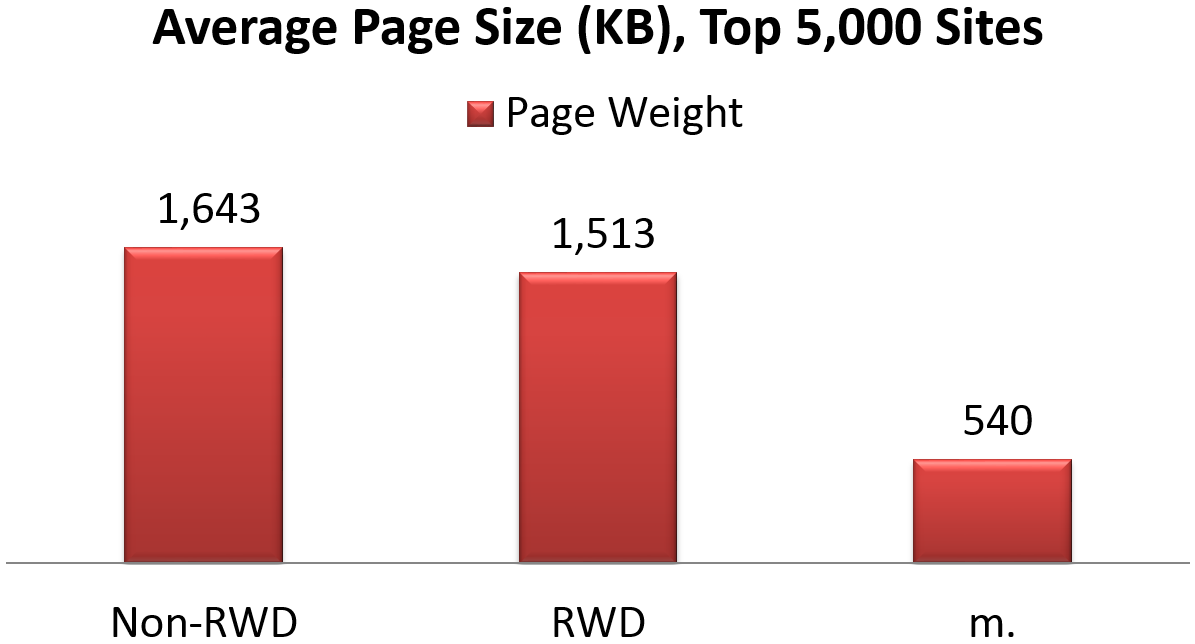
The RWD page size is still much larger than the average mobile site:
In Podjarny's talk he did not provide any practical tips on how to implement a better RWD sites. However I remember writting a blog about making a better responsive site, which was writen from a design / UI’s perspective. After the talk, I followed Guys 's twitter and found he have an article “Top 5 Tips for Making Fast RWD Sites”, which focused on the prespective of a developer – how to make RWD site faster. Here is a short list of his tips:
- Avoid downloading hidden images by using a JavaScript-based or CSS-based image loading technique.
- Download images appropriately sized to the relevant screen, a technique known as “Responsive Images“
- Conditionally load JavaScript, and especially 3rd party JavaScript.
- Use RESS – REsponsive + Server Side – to optimize your site for known clients.
- Introduce performance testing into your QA or build process.
Minimize the design!
However, it usually is a struggle to get the team to utilise the different responsive techniques. These can be very complex for development. Where possible, minimising both the design and images used for an RWD site in mobile mode can greatly reduce the page loads.
Make it faster! Speed and efficiency should be your main priorities when examining how well your responsive web site performs.


