


Meaningful Form Validation
When building forms for websites – from a developer point of view at least – you need to account for the possibility of complete user failure. More so than that, you need to account for malicious users (or bots) attempting to hijack the form for nefarious purposes. The technical aspects of limiting these situations are not what this blog is about.
We’ve all spent the time filling out a long form to apply for a loan, enquire about a product or just complain about something, accidentally entered the wrong information in a field and then been presented with nothing more than this:
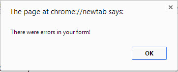
Not very helpful. Leaving your users to scratch their heads as they try to work out what they did wrong will simply frustrate them and perhaps even convince some not to bother trying again.
It is important to explain form errors to users in a positive voice, with clear indicators on what needs to change for the entered data to be valid.
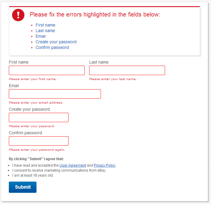
eBay.com.au - Their registration form could not possibly be clearer with its error handling. The summary at the top makes it obvious that there are mistakes that need correcting and specifies the affected fields. Each field is highlighted red indicating error, with a friendly message (again in a positive voice) explaining the issue. This validation appears when the form is submitted.
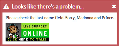
ThinkGeek.com describe the issue with a little humour and importantly, a link to their live support in the error dialogue itself, should the user need further help.
Validation that triggers when a user leaves a field (before the form is submitted) is even better as the problem can be dealt with before proceeding. Some examples of immediate feedback would be:
- A credit card that does not match a valid card type
- An invalid email address
- A username that is already in use
- A password strength meter
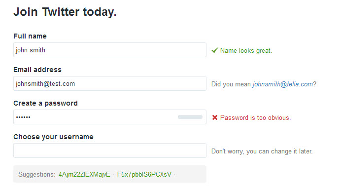
Twitter makes great use of such practices on their signup form:
- Immediate feedback on key up from a field
- Positive descriptions of what needs fixing, and reassurances about the process
- Colour coding with simple iconography that cannot be misinterpreted
- Suggestions on how to improve the data in the form
Website forms are the gateway to the rich content that your website is all about, so make them a aimple and pleasurable experience.

