How to improve your designs with perfectly paired fonts
Pairing fonts can be a challenge and for good reason. It’s an art that creates beautiful pages, defines the tone and voice of a brand and can make or break readability.
Here are a few tips to follow when picking your font pairings.
Make it legible
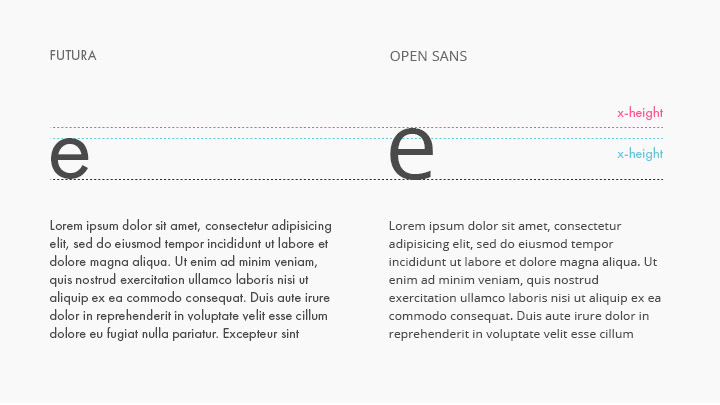
Not all fonts are–or should be–created with legibility as it’s primary design consideration. Many fonts are created for typographic statement but using a font with a balanced x-height (the height of the lowercase ‘x’ in a given font) will ensure good legibility at any size. This is particularly important for any body copy as smaller x-heights reduce legibility making it more difficult to read.
Find fonts that contrast
When combining fonts, go for contrast. This could be as simple as varying the size or weight of the same font or, trying the classic pairing of san-serifs and serifs for a more dramatic design.
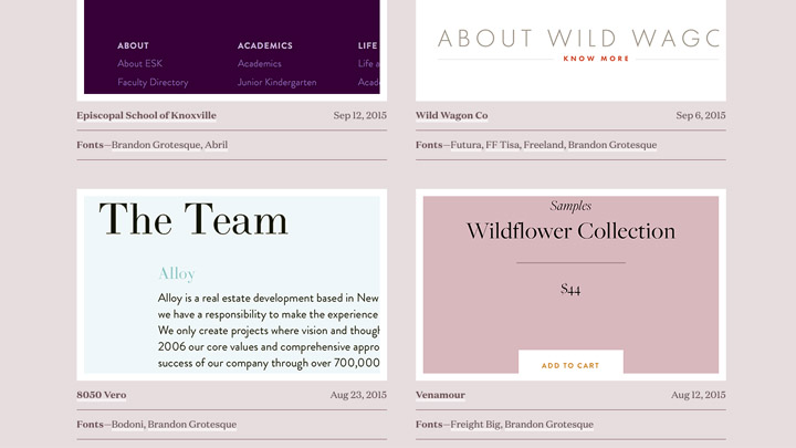
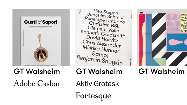
Find inspiration
Let’s be honest, everybody gets stuck and here are two great, comprehensive galleries for typography and font pairing inspiration that I use.