


Damn…You Ugly
Caution: if you are a designer you may cry.
Now I may have chosen to write about this because I want to write about Ling’s Cars at the end, but I need to make one thing clear first: Wiliam would never design a website in MS Paint like Ling has.
What I’m going to explore is the question; if cheaper, less aesthetic eCommerce websites convert better?
Firstly, you need to understand who your target audience is. For an eCommerce site, you don’t necessarily have to make it look expensive. If you aren’t selling BMWs or Rolexes you might want to consider how expensive your site looks.
This is not to say that you should ever compromise on the quality of your site. What I’m more trying to say is that by making your site look cheaper, you could directly impact user’s perceptions on your prices. In a good way.
Deals
What’s the one thing most users immediately go to when on eCommerce sites?
Sale
Clearance
Reduced Prices
DEALS!!!
Buy 3 products for the price of 2! When you only needed 1 anyway or didn’t know you needed it in the first place…
Make sure that any deals or guarantees are prominent on your homepage and within the search and checkout process.
Don’t be afraid to make it as in your face as possible.

It’s Not All About Looks
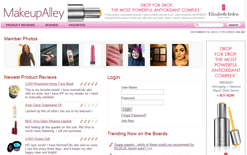
One site I would like to talk about is MakeUpAlley.com. This is one of the largest makeup review sites online hosting well over 2 million reviews with 130,000 products.
When looking at other beauty branding online, you see sites with rich imagery, expensive products and large content snippets dedicated to how this serum will change your life.
Does Makeup Alley do this?
Nope.
Ugly.
Ok that might be a bit harsh, but it’s definitely not a site you come to for its rich design.
But Makeup Alley isn’t trying to sell me anything. I only want to read a review, then tab back to the product I want to buy. I don’t care what the site looks like.
Why waste my time having to navigate my way through images, carousels and the like. Take me straight to the content!
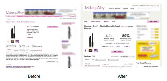
Last year they made a few changes to the site by increasing the prominence of product names and rating statistics. They also restructured the layout so that review content was separate to member content and placed an additional ad per detail page.
From this, their on-site interactions increased by 171%.
There were 21% more clicks to affiliate links.
Along with a 50% increase in AdSense revenue.
Another website that comes to mind is Gumtree.com.au
This is Australia’s top online classifieds website.
So does it have large beautiful images of products on offer? Is it spaced out and not cluttered?
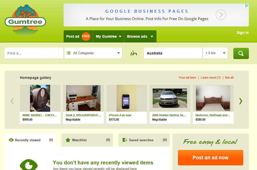
Nope.
Ugly.
But does it need to be a beautiful image heavy website? Users just want to advertise their products or search. They don’t need any distractions.
In the UK it’s in the top 30 of online sites used with an average of just over 9 minutes on the site.
Let’s look at a couple of eCommerce examples.
With Catch of the Day and the Catch Group, they started off with a revenue of $7 million in year one and jumped to $60 million by year 4!
The design is the way it is, to show users that they are receiving the best price possible.
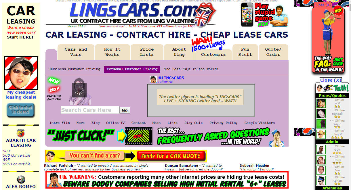
Now this is obviously the extreme, and I would NEVER recommend for anyone to make a site like this. But it is quite remarkable how Ling’s Cars has managed to be one of the top car retail sites in the UK.
Careful, you may swear when opening this link: http://www.lingscars.com/
Again, WE WOULD NEVER DO THIS AND YOU SHOULDN’T EITHER.
But I still find it astonishing that a site with this design could be so successful. Of course a lot of it relies on the design being so hilariously atrocious that it went viral. Although it wasn’t just sent around for laughs, she had a turnover of £35m in 2010, and rose from there!
I mean… I’m speechless…
It’s what’s on the inside that counts
One thing you can not falter on is the UX of the site. This is THE most important. Your site doesn’t necessarily have to look expensive but you can’t compromise on the user experience and usability of the site.
I don’t want anyone to get to the end of this and think that I’m suggesting that we simply just colour fill our prototypes to make websites. I’m just pointing out that a lot of the time all a user cares about is an uninterrupted flow to perform the tasks that they need to on the site.
Bringing out deals and promises make products and prices look more achievable and within customer’s price ranges. Give the user the best experience through the UX to streamline the conversion process as much as possible.
Sometimes, ugly sites just work.


