


CSS only goodness: Part V
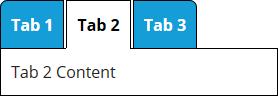
It's been a while since I demonstrated some CSS only goodness, so here's an extra cool one. Tabs with CSS3 only! No javascript required. It even allows for flexible height content and tabs.
<div id="tab-eg1">
  <input class="tab-state" type="radio" name="tab-state" id="tab-1" checked="checked">
  <input class="tab-state" type="radio" name="tab-state" id="tab-2">
  <input class="tab-state" type="radio" name="tab-state" id="tab-3">

  <div class="tab-tabs">
    <label for="tab-1" id="tab-1-tab">Tab 1</label>
    <label for="tab-2" id="tab-2-tab">Tab 2</label>
    <label for="tab-3" id="tab-3-tab">Tab 3</label>
  </div>

  <div class="tab-panels">
    <div id="tab-1-panel" class="tab-panel">
      Tab 1 Content
    </div>
    <div id="tab-2-panel" class="tab-panel">
      Tab 2 Content
    </div>
    <div id="tab-3-panel" class="tab-panel">
      Tab 3 Content
    </div>
  </div>
</div>

<style>
  #tab-eg1 .tab-state {
    display: none;
  }

  #tab-eg1 .tab-tabs {
    border-collapse: separate;
    border-spacing: 2px;
    display: table;
    position: relative;
    z-index: 1;
  }

  #tab-eg1 .tab-tabs label {
    background-color: #159dd8;
    color: #fff;
    border: 1px solid #000;
    cursor: pointer;
    display: table-cell;
    padding: 10px;
    vertical-align: middle;
    font-weight:bold;
  }

  #tab-eg1 .tab-tabs label:first-child {
    border-radius: 7px 0 0;
  }

  #tab-eg1 .tab-tabs label:last-child {
    border-radius: 0 7px 0 0;
  }

  #tab-eg1 .tab-tabs label:hover {
    background-color: #42b7ec;
  }

  #tab-eg1 #tab-1:checked ~ .tab-tabs [for="tab-1"],
  #tab-eg1 #tab-2:checked ~ .tab-tabs [for="tab-2"],
  #tab-eg1 #tab-3:checked ~ .tab-tabs [for="tab-3"] {
    background-color: #fff;
    border-bottom-color: transparent;
    cursor: default;
    color: #000;
  }

  #tab-eg1 .tab-panels {
    border: 1px solid #000;
    margin: -3px 0 0 2px;
    padding: 10px;
    background-color: #fff;
  }

  #tab-eg1 .tab-panel {
    display: none;
  }

  #tab-eg1 #tab-1:checked ~ .tab-panels #tab-1-panel,
  #tab-eg1 #tab-2:checked ~ .tab-panels #tab-2-panel,
  #tab-eg1 #tab-3:checked ~ .tab-panels #tab-3-panel {
    display: block;
  }
</style>


