


Top Axure adaptive view layouts
Axure 7 has now been out long enough for everyone to be up to speed with how it works. If you’re just getting your mind around the new version now, the big change you’ll notice is…
Adaptive views
Adaptive views solve a lot of problems for people who were trying to make Axure 6 do adaptive with 3 times the dynamic panels needed. The big question is:
'What views do I add?'
This can be difficult! The assumed desktop-tablet-mobile probably isn’t the right answer!
Unfortunately, only stumbling through a couple of adaptive prototypes will let you know what works best for you, but I’ve found the three layouts to work best for me:
Disclaimer – the descriptions and resolutions I’m going to use here are to express the examples. I know there’s a multitude of different resolutions, platforms and devices. I know tablets can be held in portrait OR landscape. I know that phablets exist. That aside the terms I’m going to use reflect the following ideas:
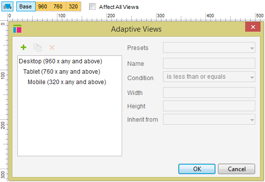
Desktop – these are our traditional 960px landscape views. Desktops, laptops and portrait tablets.
Tablet – these are our portrait views. Portrait tablet, phablets, even landscape mobiles
Mobile – our traditional 320px mobile view. All small screens except a smartwatch!
Mobile-first
When I work mobile first, I feel like I need to conquer both ends of the spectrum before working on the middle. Although it might feel logical in adaptive views to keep stepping up (or down) is size, I prefer mixing it up.
Starting with mobile, I move to desktop, then back to tablet. It’s a bit of jumping around, but feels like a more natural inheritance to me…
I still want to work at 960
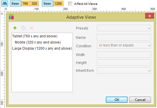
Working at 960 is still natural for me. I’m probably showing my age, but anything larger makes me feel like I’m creating layouts the creating designers will abhor… However, large screen layouts are a very real consideration these days. Jump into Google Analytics, you’ll do well to find a 4:3 resolution of any significant usage.
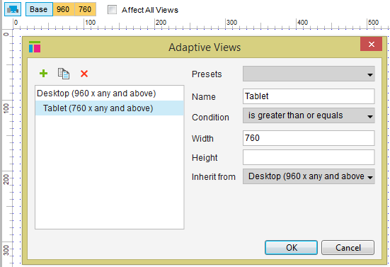
I like large displayed, but I still want 960 to be the Base, therefore I put Base in the middle and have Tablet and Large Display both inherit from it.
Tablet is the odd one out
People often ask me:
‘What grid do you use?’
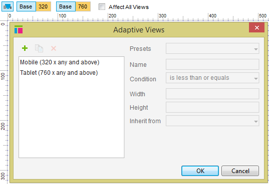
The answer is ‘no’. Well, not really. I don’t set grid lines, but I do use Axure’s grid. My grid is blocks of 320. Mobile is 1 x 320, tablet is 2 x 320 and desktop is 3 x 320.
This is the quick way to prototype in my opinion. A tablet is usually wider than 640px, but the tablet will zoom nicely and it stops you doing anything too untouch-friendly.
Sometimes however, it’s important to get tablet a little closer to 760px. Still, I find that I use a lot of 320px width items. This makes mobile and desktop easy, but tablet the odd one out! Therefore, I don’t put tablet between desktop and mobile. If I do I find that I do desktop, resize things for tablet and then size them back for mobile. This view layout avoids this.


