


Implementing pages from design files
There are a lot of tutorials on the web on how to use HTML, CSS and Javascript. But it’s difficult to find one that teaches you the big picture, or the steps involved in a real task. This article will address the general work flow, as well as how to approach your code, to produce an accurate recreation of a design.
What steps should be taken when implementing a design?
Skeleton
The first thing is to get your folder structure and tech stack up and running. This can include creating folders, setting up CSS pre-processors, task runners, source control etc. I usually have a folder named after the project, with my bowerrc, gitignore, package files etc in the root. Then I create folders:
- source
- node_modules
- build
In source, I have:
- markup
- styles
- scripts
- images
- vendor
I use ‘vendor’ to store bower-installed libraries. My gulp file compiles everything into the build folder, which usually has the folder structure:
- img
- js
- css
The HTML is built into the root of the ‘build’ folder.
Framework and base settings
Now I will need to, at least partially, address the base settings of the page. This means the default values within the base SASS file.
I will identify the base font size, family, line height and colour, then apply it to the HTML element. I will usually look at a generic content page design to determine this, if available, instead of the homepage design. The homepage usually contains the most exceptions to the rule, which will make it harder to determine the base properties.
Then comes the headings, labels and form elements, anchors, tables, lists, paragraphs, buttons and any other common elements in the design. I need to identify what properties I can set for these elements, that will be used by most instances.
I need to determine what, if any, frameworks will be used and style the basic classes for them. EG: If using Bootstrap, I may style btn, btn-default, btn-primary and any other classes I think might be used. Can I identify any consistent spacings? If so, I may need to change the gutter widths in the grid system to match.
I also need to measure how wide the page is going to be. This can be tricky if the design is a bit out-there. Sometimes the main content is more narrow than other parts of the site. Some widgets may have different widths or may be centred.
I will usually start measuring the page width from the header, unless the header is full-width. Then I will measure the footer to see if it matches. The content is usually the same, but sometimes there may be a widget or two that will extend beyond the borders of the normal widgets. There may be some that are narrower. The key here is to determine what is the rule and what is the exception. Most of the page will use the correct page width, but if the design is really out-there, I may need to just pick the widest example.
One key point is to know what will be a background-image, and what will be content. I don’t need to consider extra width caused by background images, as the image can be used on a wrapping element (the parent of the container-fluid.) CSS shadows also shouldn’t contribute to the width of the container, as they can freely overflow into the container’s padding most of the time.
Once I have determined the ‘rule’ for page width, I can write a ‘container-fluid’ class, EG:
.container-fluid
{
    max-width: 100%;
    width: 963px;
    padding: 0 20px;
}
Since I will be using ‘box-sizing: border-box’ on everything, the padding value (x2) is added to the width, so that the actual content of the container will match the width found in the design. I will usually store this width as a SASS variable and use it in media queries.
I usually ascertain the padding of this container by looking at the mobile design, measuring how much padding there is between the edge of the artboard and the content. However, if there is a tablet design and it has different padding, I may need to take this into account. If I am coding mobile-first, I use the mobile padding as default and override it later. If I am coding desktop-first, I use the tablet padding and override it later for mobile.
Fonts
I should get the fonts working as soon as possible. This is very important to get working before I start any other coding. This is because, as I will mention below, it can affect line heights and, therefore, the top / bottom spacing between elements, I don’t want to change fonts and discover that, due to how the font renders, the spacings now need to be redone.
It’s very simple to get fonts working if they are Google fonts, or the webfont kit is available for download. It can sometimes be difficult if it’s a licensed service that has a URL white-list. I may need to add the development URL to the whitelist to allow the fonts to load. However, if I’m using a ‘localhost’ URL, most font services should allow the fonts to load.
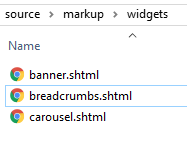
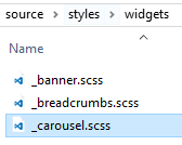
Files and widgets
The next thing to do is determine which parts of the design should be labelled as widgets.
It’s easy to feel overwhelmed by a large project, but if I identify and name the widgets from the start, I will have lots of small, measurable, and quickly achievable goals. This takes off a lot of pressure and it will be easier to give accurate time estimates. I will always know how far into the project I am, and I will know how much work is left to completion.
A widget is a part of the design that is identifiable, re-usable and moveable. A widget should be as self-contained as possible, in case a client wants to remove, re-order or replace it.
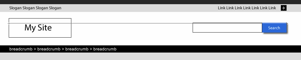
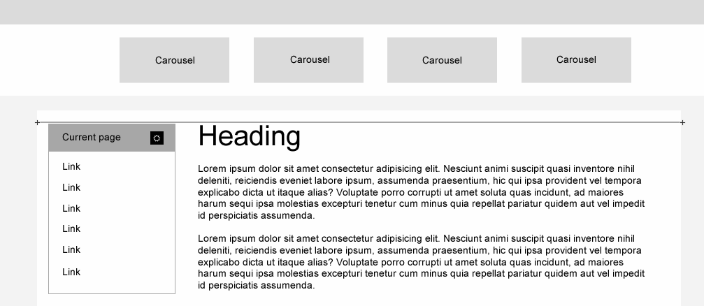
I might see a header, footer, banner, carousel, product list, sidebar navigation, search result sort bar, site search widget etc. Widgets can be entire horizontal sections or smaller uniquely designed boxes, depending entirely on the design and how effectively I can separate them from each other.
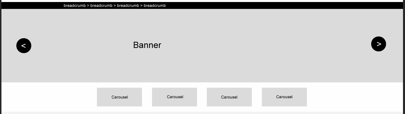
I create HTML and SASS partials named after each of these widgets, ready to be coded. Then I move on to coding my first widget. I usually do the header and footer first, then from top to bottom / left to right, in order of appearance.
I will do one widget at a time, and fully complete it (including tablet / mobile), before moving onto the next one. I may discover things during this time that will prompt me to go back to my base file and change some of the defaults.
I start by coding the entire HTML for the widget, then move onto the CSS, then onto Javascript if needed. When coding the HTML, I need to keep in mind accessibility and how the aria attributes will be used with the CSS and Javascript. If I leave this to the end, I may need to redo major portions of my work, which is a waste of time. It’s better to code the widget properly from the start, instead of retrospectively adding accessibility.
My HTML structure for a widget will start like this:
.w-widget-name>nav.w-widget-name-container.container-fluid
An example:
<div class="w-breadcrumbs">
    <nav class="w-breadcrumbs-container container-fluid">
    </nav>
</div>
The inner classes will depend on the widget, but I will try to be as consistent as possible. For instance, if I have a list of things (products, users, etc) I may have an element with the class of .w-widget-name-holder surrounding the list.
Approach to measurements and spacing
A major part of ‘slicing’ is measuring the distance between things on a design file. If using Photoshop, the ruler tool can be used. If using Illustrator, drawing a box between things is very effective.
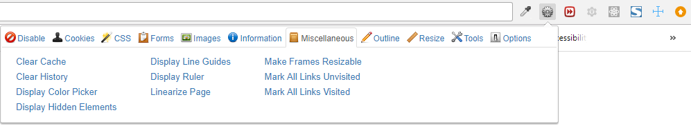
When measuring the sliced page, a useful browser extension can be used, such as the ‘Web Developer’ (it has a ruler tool under miscellaneous) or ‘measure dimensions’ Chrome extension.
Sometimes a lot of time can be wasted by measuring incorrectly, producing too much or too little spacing, then fixing the code when the designer spots these mistakes. It’s better to get it correct the first time. These inaccuracies usually happen when line-height or border-collapsing isn’t considered.
Also, measurements should never be taken from a PDF. This is always a recipe for disaster. The PDF can often be exported incorrectly, appearing much more ‘zoomed in’ than the design file. Clients also tend to view PDFs at seemingly random zoom levels, usually around 70% – 80%. Always trust the design file, not the PDF.
Left and right spacing
This is the easier of the two types of spacings to measure. But there may be one or two things to think about.
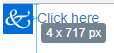
If I have an inline / inline-block image followed by text, the space in the HTML between the image and text will be render as a space on the page. When adding a margin to the image, I need to either account for the width of that space, or not have any space between the image and text.
<a href="/blah"><img src="img/log-1.png" role="presentation"> Click here</a>
Spacing between horizontal items (EG: horizontal navigation, search result sort bar) can be approached in several different ways. I can add a default margin-left to an item, and remove it from the first child. Or I can add a default margin-right, and remove it from the last child. This is the old-school method. A newer method is to use the adjacent sibling operator in CSS to apply a margin-left:
.w-widget-name-item + .w-widget-name-item
{
    display: inline-block;
    margin-left: 10px;
}
Keep in mind that if I’m setting the items to inline / inline-block, the white space between items in the HTML will add a visible space between items. I will have more than 10px of spacing in this example. I need to take this into account or not use inline / inline-block. If I float the items or use flexbox, the white space will be ignored and I will have exactly 10px of spacing.
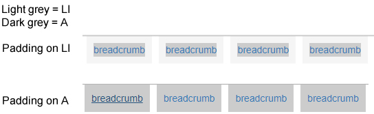
Another way to add spacing is to use the ‘bootstrap 3 method’. This adds padding or margin to both the left and right sides, while using a negative margin to the parent element to hide the indent that this would normally create:
.w-widget-name-holder
 {
   margin: 0 -5px;
 }
/* (clearfix omitted from example) */
 .w-widget-name-item
 {
   float: left;
   padding: 0 5px;
 }
This adds 10px of spacing between the items, but the left and right sides should line up nicely with the rest of the content.
Top and bottom spacing
Understanding collapsing margins is important. This means that, for block-level elements that are adjacent to each other, the margins between them will be combined into one. So if the top element has a 20px bottom margin, and the bottom element has a 30px top margin, the total distance between them will be 30px.
Margins can also collapse between parent and child elements. If the parent element contains no border or padding, the margin of the child element will act as though it’s attached to the parent element.
Note: Floating and flexing elements will disable their border-collapsing functionality.
Within a general content page, implementing spacing between headings, paragraphs, lists and other common elements can be done using several different methods, including the following:
Margin-top
Give h1s no margin, then give every other relevant element a margin-top. This works well for simple content if there is always a H1 at the top of the content container.
Margin-bottom
Give every relevant element a margin-bottom. This will create extra space at the bottom of the content that will need to be taken into account, unless the last-child of each element is reset. This is the approach Bootstrap takes, but it doesn’t reset the last-child. The issue with resetting the last child is, when using Bootstrap columns to organise content – the last child will apply to the last child within the column, not just the last child in the content container.
Double Margins
Give every relevant element a margin-top and margin-bottom. This utilises collapsing margins. It can work well when simple content is combined with DIVs, but if Bootstrap is being used to create multiple-columns within the content, this will create double spacing. The columns are floated, so the margins of the first and last elements within them won’t collapse into the column DIV.
Lobotomised Owl
* + *{ margin-top: 15px; }
Use the lobotomised owl selector to add default margin-top to every sibling. I avoid lobotomised owl for anything but simple designs, as it will result in a lot of margin: 0 declarations. But it works well if no framework is being used.
Just add a rule
This is my preferred method, as I am in complete control of everything. I could always just add a margin-top to the widget if it comes after something:
* + .w-widget-name { margin-top: 15px; }
I could then write another line to address any preceding element that may require a different margin:
h1 + .w-widget-name { margin-top: 12px; }
And so forth. This is the most accurate method, in order to reproduce a design as precisely as possible.
A generic class
I could create a new class to add to any widget that is within the content container:
* + .content-container-widget { margin-top: 15px; }
The disadvantage to the above line, is that every widget will have the same margin-top. This is not desirable, as some widgets have hidden white-space that need to be accounted for. For example, a widget that incorporates a heading may have extra top spacing, due to the heading’s line-height, compared to a widget with a border or background that defines the top border.
Incorporating line-heights
When measuring distances between text and other elements, the line height must be considered. If I have 16px font size with 1.5 line-height, then as a very general rule, I will have about 4px of top and 4px of bottom spacing applied to each line of text. When measuring between text and another bordered element, this extra 4px of space needs to be accounted for. When measuring between two lines of text, 8px of space needs to be accounted for. This means taking the distance and subtracting that extra space, to arrive at the actual margin or padding needed to achieve the spacing on the design.
An example with 14px font size:
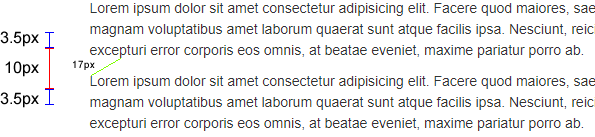
A common issue is aligning the top of the h1 in the main content with the top of a sidebar. If the h1 has a 1.5 line height, the extra top spacing will make it appear out of alignment with whatever is in the sidebar. If a border or background defines the sidebar, this will exacerbate the misalignment.
To fix the alignment issue, a negative margin could be used on the heading, or the line height could be reduced. Alternatively, padding could be added to the sidebar column.
I can also add a margin-top to the widget within the sidebar column. This is a good solution, because different sidebar widgets may require different margin-tops to appear aligned with the heading. Imagine a border-defined widget and a widget with no border, but a heading. The one with the heading, because of the line height, will need slightly less margin.
Note: In some cases, when adding margin-top to the first element within a DIV, I may encounter border collapsing issues. In this case, I will need to add 1px of padding-top to the parent DIV. But this is a rare occurrence within a sidebar, as the sidebar is usually floated or flexed, which stops border collapsing.
Where to add spacing
Imagine an unordered list structured in this way: ul>li*8>a.
If I need to add padding and a border, which elements should have those properties? I usually add margins to the list-item, padding to the anchor and borders to the unordered-list. A common mistake is to add padding to the list-item. This is because the clickable area will be unnecessarily small, which is bad for usability.
The same goes for anchors within headings. I want to make the clickable area as big as possible. I will address this topic, regarding icons, in the section below.
Positioning elements
There are several ways to position things – float, position: absolute, display: table, flex etc. The Bootstrap 3 grid uses floats and the Bootstrap 4 grid uses flexbox. Flexbox and Grid are the way of the future, but what I’ll use all depends on the browser compatibility requirements of the project I’m working on. There are some cases where using a grid is overkill or not suitable, so I will address these.
Text with links or icons on the opposite side
Sometimes I’ll come across a design with left aligned text, but with an icon aligned to the right within the same line. It can be tempting just to add an <I> tag and float it, but this is never the best choice.
A background image would be preferable, with some extra padding-right to stop the text from overlapping it. But if I want to add an element to the source code, that element should be position: absolute. The parent container will need to be positioned as well, to be a reference for the absolutely positioned element, and extra padding-right will still need to be added to avoid overlapping.
The reason to avoid floats is simple: If the text gets too long, the floated element will jump down to the next line. The preferable behaviour is almost always for the icon to stay where it is, and just have the text wrap to the next line.
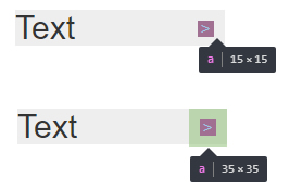
I will only add these icons as an element if I’m using an icon library, or if the icon is supposed to be clickable, but the text is not.
When adding clickable icon elements, I prefer to make the clickable area as big as possible, as mentioned in the previous section. If the design has 4px of spacing between the icon and the edge of the containing DIV, I would prefer not to use right: 4px; Instead, I will make the icon element 8px taller and wider and position it right:0; Then I will center the icon (or pseudo-element) within the element so that it appears 4px away from the edge of the container. This way the clickable area is much bigger and more forgiving for the user.
Conclusion
I am somewhat of an old-school coder, but I am keen to adopt new methodologies and technologies that make my life easier and increase the quality of my work. The approaches and thought-processes that I wrote about in this article are universal. I would say they are critical to my job, and are a product of my experience with front-end web development.

