


What is Micro UX? And why you need it for the next leg in your conversion journey.
Ok, you heard it here first.
Or maybe you didn’t, though likely you did because even though the concept has been discussed by the hardcore of UX theorists for a few years, it's about to hit mainstream: Micro UX will be one of the big trends (or at least buzzwords) of 2015.
And once you understand what it is, you’ll understand why.
(Afterall, you've been interacting with 'Micro UX' on your smartphone for a while now.)
In one sentence what is it?
Micro UX is about small flourishes, designs and improvements to a certain piece of interface or interaction that surprises and delights the user, and improves the experience.
An experience that is a pleasure to repeat.
Huh?
There are a number of articles citing the scientific differences between ‘Macro UX’ and ‘Micro UX’ and they are no doubt all correct. Though most of what I have read becomes too scientific or verbose, and our industry cannot fall into that trap if it is to help clients understand what Micro UX is and why it should be invested in.
My simple explanation (in plain English) is that Micro UX is about going to the next step with the experiences we deliver to users. Really getting into beautiful, almost hidden detail and quality with our work.
Where as Macro UX is about the user intent and what is being delivered (versus the detail of the how), Micro UX is about the detail of it:
Micro UX: |
Macro UX: |
|
|
Micro UX is about wonderful transitions, animations and effects that give users joy. Humorous and unforeseen content. Things that users admire and pay.
Looking at each feature and polishing it to detail.
Things that elevate the user experience and drive users through the experience.
Driving users to convert.
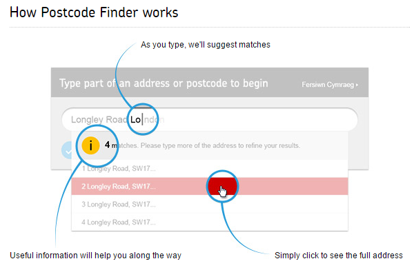
The UK's Royal Mail's Postcode Finder is an oft mentioned example, where they've polished the experience and take it to the next level:
Micro UX is the next level of UX (as it were) and it is what will be needed to compete moving forward; users will come to expect it and it will feed directly into your website conversion.
And the really good news is that you can just jump in and start doing it; no big deal, no formal process except to start plotting across the interactions of your website at a granular level, considering how you can improve them, one-by-one and all as one of a bigger, continuous story.
Who knows, you might be doing already!
Have a look at:
Here are some nice desktop examples and also here. And some for mobile, where of course the user is right up against the screen with a slower connection and so more likely to pay your Micro UX efforts!
Separately, this article looks at some of the more common transitions and effects and is a good read for any web designer.
Get on it.


