


Designing the web for people
We all remember the MailChimp Annual Report of 2013 right?
MailChimps report is a refreshing change to the depressing annual report usually distributed big corporates. These are generally a whole bunch of fluff on corporate goals, visions, sales revenue and of course next year’s targets.
All of us at some point will have read one and we no doubt find them equally as dull. I am sure even the people writing the reports hate themselves for inflicting such boredom onto their peers.
MailChimp by numbers was a beautifully clever parallax website that is definitely worth the visit.
Now I know the jury is still out on parallax websites (we all no users don’t scroll) but I am of the opinion that if they are built with a purpose, then go for it, but don’t just do it for the sake of a parallax website.
If you are still not convinced, take a look for yourself. http://bit.ly/1ElSMHy It is a bit of fun and rather clever.
You are probably wondering why I have bought up MailChimps report, but once again they have impressed me and need mentioning.
We as web designers and developers should all (sadly I say that with much optimism) intrinsically understand the principles UX, and more recently micro UX.
Yet how often do we found ourselves, even as users, getting frustrated with the simplest of things? Some of the them so simple you wonder why we put up with the experience at all.
I am sure, like me, you are not big fans of signing up for an account when you want to buy something, especially when you invariably receive an error message that you password is not valid - why didn’t they tell us in the first place we needed to have special characters, hieroglyphics, Sanskrit and 100 numbers before we entered all our details and hit “create my account”?
Its more than just frustrating and generally I give up pretty quickly – my custom is best left to those who understand UX.
MailChimp have made it really easy to sign up for a free account and decide on a password. Rather than using negative re-enforcement after the fact, MailChimp simply define what kind of password is required and shade bullet points when you have selected the correct character. How fantastic is that?
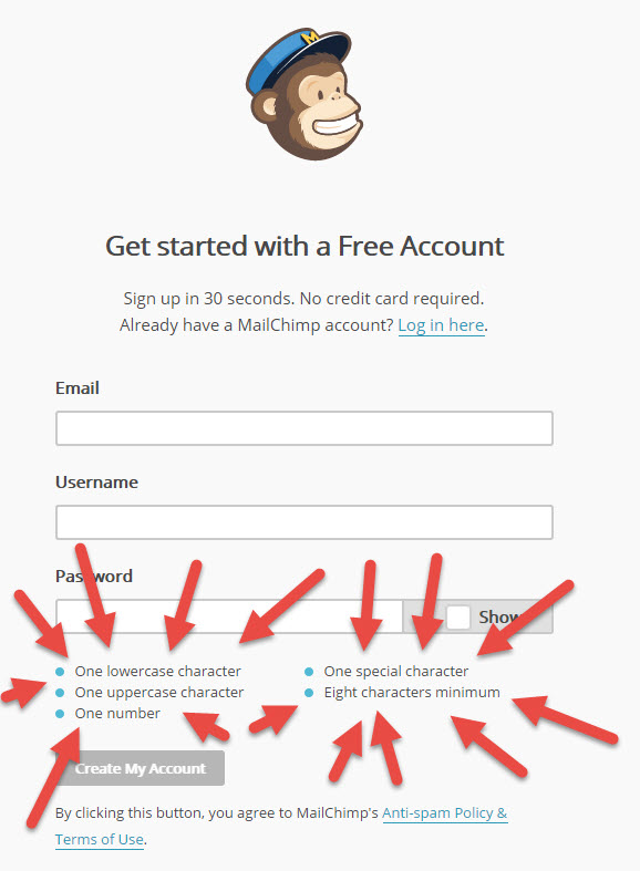
A genuine improvement and something we should be implementing all across account set up pages.
It is little alterations to design or Micro UX that can have such a profound impact on the overall UX of the website, they don’t look hard when implemented correctly, but often, like MailChimp, they can be truly inspired.
As designers, users and owners, we all need to work together to create a better web and a better experience for everyone.


