


Designing around the limitations of our cognitive systems.
The whole is greater than the sum of its parts.
The Gestalt principle literally means "form" or "configuration" it explains that there are inherent mental laws that dictate how we visually perceive objects. It states that humans tend to organise visual elements into unified wholes. Even though the Gestalt principle was developed by psychologists in the 19th century it still holds true today with web design. Evidence of this can be seen through heat mapping.
Modular design is a risk for the Gestalt theory. Users are seeing blocks of content and cannot distinguish between them, lines separate content and can often not draw a user down the page.
Continuation
Continuation occurs when the eye is compelled to move through one object and continue to another object

Your eye is lead directly to the leaf.
Modular design generally stops continuation as content is separated by straight lines.
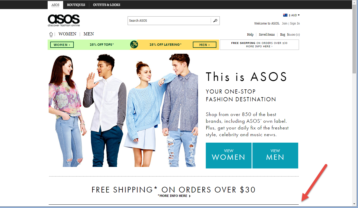
If you look at this ASOS example the horizontal line is stoping continuation and implies closure. The only thing that is compelling your eyes to move down the page is the scrollbar.
Proximity
Proximity occurs when elements are placed close together. They tend to be perceived as a group. This highlights the need to group like information, rather than separating into modules.
When the objects are close they are perceived as a whole.

The same can be said for web content. Spacious design looks beautiful however the further objects are apart from each other the less change the content will be grouped as a whole.
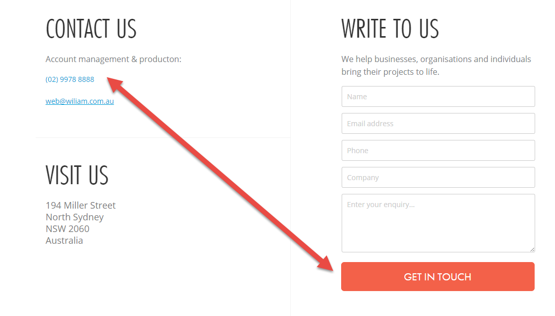
If I were to look at our contact page, there is a lot of space between the phone number and the submission on the form, this gap should (and will be) closed.
The point of looking into the Gestalt theory is that there are inherent traits that dictate how users react to a page. It is important that pages are designed keeping in mind the limitations of our cognitive systems. Putting in a small arrow may simply not be enough to take the user on a journey.
In the below example we put the arrow below to indicate you can scroll. No one did.
![]()


