


10 tips for increasing database subscribers with an email popup: the dos and don'ts that actually work
It seems that an easy solution to growing a database is to put a newsletter subscription box on your website. Whether it is in the form of a pop up or in page box, there is an assumption that this magical little box is going to save you from all your database-growing nightmares; put up the box and watch the people flood in.
Think again.
Here however are some tips to follow that will help increase subscribers guaranteed!
1. Customise your content
Assuming a pop up appears on the sales category then make sure the wording is customised to receiving sales promotions. Each category within the site should have variable text shown on the newsletter pop up, depending on where the user is within your site.
2. Don't just dump addresses into your mail system
The most valuable thing you can do with your database upfront is to segment it. Segmenting as an afterthought is a difficult and expensive job. Make sure as much information on the user is fed into the mail system as possible (even if you aren't using it yet). Some examples of what can be fed through:
- Returning or new
- URL from subscription
- Purchased item(s)
- Preferences selected
- Time on site
- Referring url
3. Show the users what they are going to get
Let's assume once again that the user is within the Sales category. In the copy of the newsletter pop up you could give them a link to the previous Sales newsletter that went out. Email platforms have an HTML alternative to the email so you can copy this link and use it in the description. If your content is good this is going to entice people to subscribe.
4. Don’t swing both ways
If you have an in page subscription box then do not use a pop up in conjunction and vise-versa.
For example: An in-page signup form on the about page. The user puts in their email address then they are shown a "thank you" pop up. If your using the in-page method stick to that, show the validation message in the place of the box as this is where the user is expecting it to appear. You already have their email so now showing a pop up is going to cause anxiousness as they were not expecting a pop up to appear and now have to go to the trouble of closing it (or your website).
To flip it around: a pop up appears asking for an email address, the user fills it in and then on the page (somewhere) is a confirmation message. This should remain within the pop up as this is what the user is expecting. Be consistent.
5. Don't slap them with the pop up straight away
Putting a popup on load is going to scare the user and increase your bounce rate. Be tactful as to when it is activated, perhaps it is when the user has scrolled half way down the page or maybe after 15 seconds or 2-3 page views. Keeping in mind that a study by WhichTestWon found: the 15-second timing beat 30-seconds by 11% and it beat 45-second timing by 50%.
6. Ask about them
Not personally but ask about their preference. Segment and write custom newsletters based on this.
7. Show you’re a community
If you have a large database then tell the user this. Having social signals is going to increase sign up conversion, say something like "Join the other 55,000 Australians..". Make them feel like they are missing out if they don't subscribe. (Having said this, we wrote a blog two years ago about this social proof tactic where the author (not me!) argued the opposite. I guess test it for your website...)
8. Don't black out the site
Don't make the pop up intrusive or offensive and a dark black background will do this. Make the opacity as light as possible so the user can see the background text.
9. Distinguish between the pop up and the tick box on the bottom of a form
People who have signed up via a pop up are, in theory, going to be more keen to receive newsletters than someone who has not un-ticked a subscription box when filling out a form. The pop up people have actively put their address in so they should be flagged differently within the mail system.
10. Don't show the pop up twice
Make sure it sets a cookie so that once it has been closed or filled in it doesn't show again.
And for all the doubters of the email popup...
Have a look at this!
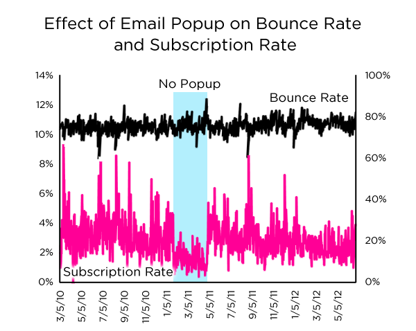
The graph above is from a test, where a website turned off its email subscription popup for a period, versus a periof before and after where the popup was running.
The website's bounce-rate remained consistent in either scenario, putting to bed the theory some people have that email subscription popups cause people to leave screaming: the black line.
If you look at the pink line however, unlike the bounce rate which remained consistent, where the popup was enabled, the email subscription rate of the website trebled. Like between 3 and almost 5 times.
And all with no discernible downside.
Get those popups out people and stop making excuses!


