


The 19 most common mistakes that will affect your conversion
Did you know that 97% of visitors who come to your website are not ready to make a purchase? So how do you convert these users?
I recently read an eBook from HubSpot which went into detail on what they believe are the ‘19 Blunders That Are Hurting Your Conversion Rates’. Although these may seem obvious, you will be surprised at how common these mistakes are. But the good news is that they are really easy to fix.
- No call to action under product thumbnails prompting shoppers to learn more
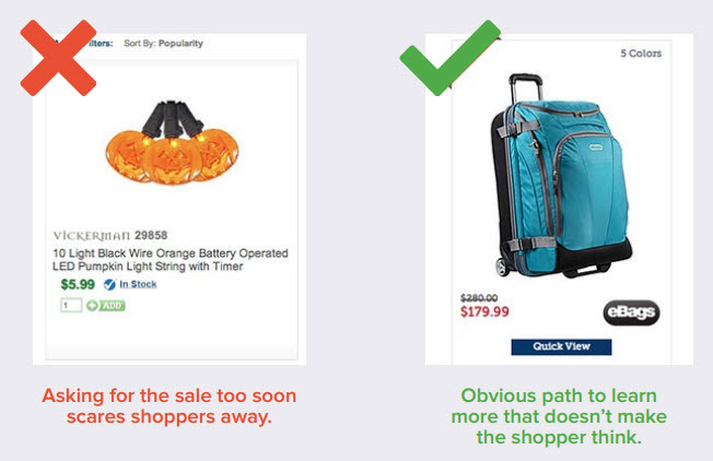
It’s quite common to see an ‘Add to Cart’ button underneath each product on the listing page. But how many users want to add a product to their cart without learning more about it first? You don’t necessarily have to take them off the listing page to the product detail page to get them to add to cart, but there are options like ‘Quick View’ which can give users a quick snapshot of the product details whilst still allowing them to browse easily through other products.
- Add To Cart button colours that blend in with other colours on the page
Call to Actions need to jump out of the page at you. You should be able to go to any Product page, zoom out on your browser window and still have the ‘Add To Cart’ button standing out as the key feature.
- Failing to emphasise “this site is secure” on the first step of checkout
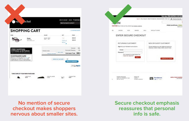
You don’t have to go with a cheesy iStock icon of a padlock, but make sure you tell your users who they are checking out with. Include the payment gateway logo and the SSL certificate. But more importantly than the logos are the two key words which will put any user’s mind at ease: Secure Checkout. By reading ‘Secure Checkout’ as the title of the page, it makes a huge difference compared to just ‘Checkout’.
- Neglecting to advertise shipping promotions near your Add To Cart button
I’ve previously written about the lengths users will go for free shipping. The key tip is to relieve any anxiety that users may experience in the checkout process. You need to guide them through and convince them that adding this product is the right thing to do. Don’t just advertise shipping discounts at the product detail level, instead make sure it is on every step of the checkout. A recent test run by HubSpot found that this resulted in a 15% increase in conversion per visit.
- Not making “free shipping” more prominent than the words around it
If you are running an offer where a user has to reach a certain price threshold to qualify for free shipping, make sure that the words ‘Free Shipping’ are the most prominent. Also don’t rely on the users to work out if they have qualified or not. Tell them on any product that is over the threshold amount and also tell them at the Shopping Cart if they have qualified.
- Not confirming “free shipping” throughout your checkout to qualify shoppers
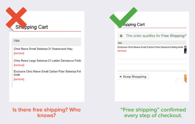
As I have mentioned above, make sure that ‘Free Shipping’ is present throughout the entire checkout process. Don’t be afraid to overdo it, you can’t have users forget!
- Not surfacing product review stars on section pages
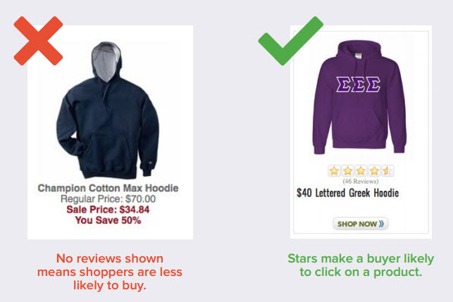
Hubspot found that 63% of us are more inclined to purchase from a site that has product reviews. Showing ratings out of 5 stars helps users discover the most popular products and encourage them to spend longer on the site.
- Displaying left-hand navigation on product pages
It’s important not to overwhelm your users with choice when they are on the product detail page so close to purchase. The less links the better, as you want the only way for them to move forward by clicking on Add To Cart. Make sure that you don’t include a left hand sub menu on any detail pages.
- Ignoring cart abandonment
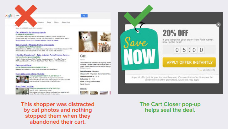
75% of shoppers who add items to their cart end up abandoning the process before going ahead with the purchase. A great way to remind users is by using pop-up window reminders to advertise deals.
- Making site search hard to find
Most users will arrive at your site with a specific product in mind rather than just to browse. Therefore you need to make sure that your Search bar is prominent. Don’t just use an 8th of the screen width and place it in the top right hand corner. Make it huge! When users click into search don’t be afraid to make it the width of the site.
- Vague error messages on checkout pages
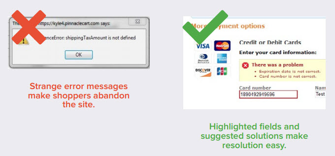
Errors in the shopping cart are unavoidable at times, everyone knows that things can go wrong. That’s why it’s important that you write custom error messages for any responses that you receive from your payment gateway. Make sure they are user friendly.
- Having a generic “About Us” page
Conversion is all about TRUST. Make sure you tell a story about your brand on the site.
- Cluttering your “Sort By” options
Filters are essential on any eCommerce site but you need to make sure that you don’t overwhelm users with the options. Use analytics to find out what users are sorting most when viewing results and prioritise these filters.
- Neglecting easier conversions like mailing list subscriptions
Most users who come to your site and don’t make a purchase, will likely never return. Mainly because there is no way that they can be reminded of offers. Make sure that you offer discounts when signing up to your mailing list.
- Leaving out “Low Price Guaranteed” messaging from item pages
Using wording like “Lowest Prices Guaranteed” near your Add To Cart button has far more advantages than placing it in the header where it can be lost with other content.
- Missing obvious navigation segmentation opportunities
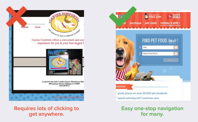
It’s important to make it’s easy for users to find exactly what they are looking for in the fastest time possible. You can ask questions prior to search, rather than users having to navigate through the menu.
- Putting your Add To Cart button below the fold
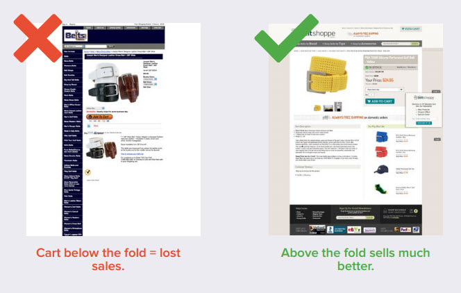
As mentioned before, the Add To Cart button needs to stand out the most on the page. It also needs to be easy to find. ALWAYS make sure it is located above the fold. If you have a long detail page, you can place the button at the bottom of the pages as well so that it’s never lost.
- Failing to put time limits on special sales
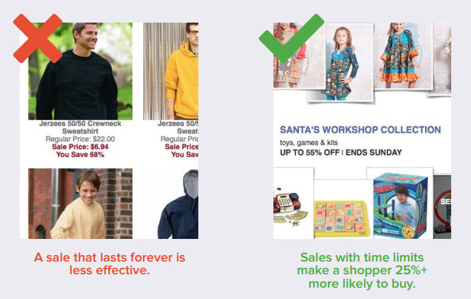
Try to create a sense of urgency when offering discounts. Use a time limit such as ‘Ends this Sunday’ or even use a countdown clock. Make users feel like they can’t miss out!
- Stale homepage content
Although users don’t spend much time on the homepage, make sure that it is still constantly refreshed with new trending, seasonal and popular content. This will benefit returning customers and encourage browsing and conversion, not to mention the SEO benefits of updating your content frequently.


