


Make your credit card fields look like a credit card.
Why not? Give it a try and see if it increases conversion.
I just purchased a subscription to TreeJack and their credit card input field looked like:
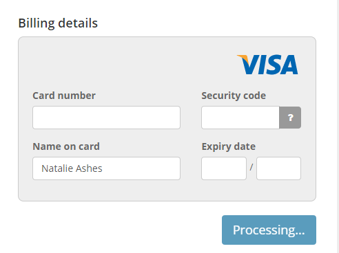
I thought it was pretty cool. I found this tool which will mimic the input: http://kenkeiter.com/skeuocard/
A study I read said that:
people think that certain parts of checkout forms are more secure than others.
Adding visual clues such as borders and background colours gave the perception of secure areas on a page.
What's more secure that fields that look like a credit card? It also means people will easily be able to type out the information as it looks just like their card.
The end.


