


Jira, why is the UI/UX design so bad!
I am trying to use Jira at the moment and I am finding it difficult. Not difficult in the sense that I don't understand it. Rather, I find it hard because the UI/UX is not thought through, which is frustrating.
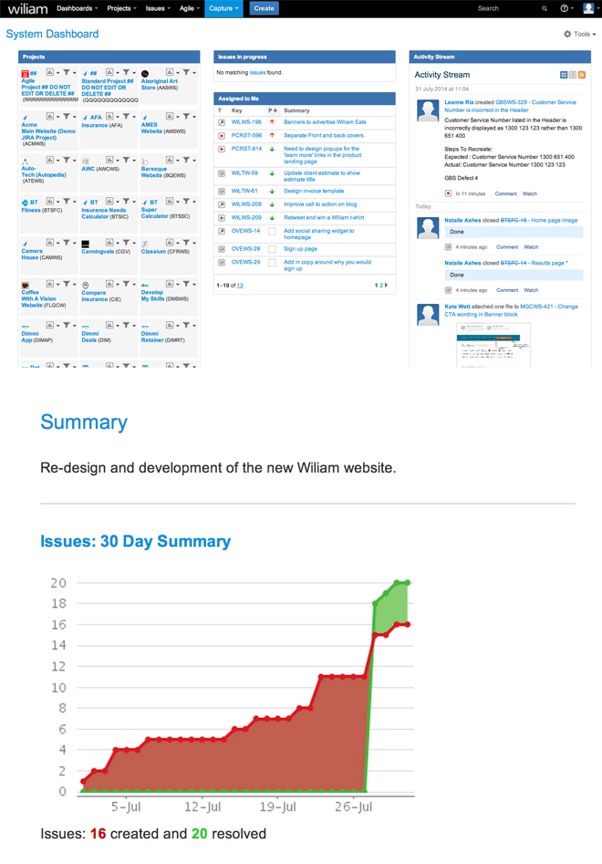
I regularly think I’ve got the hang of jira and then the next day I log back into it and find myself on a page with loads of links to sections that doesn't matter to me or the task I need to complete. Also there are visuals that make no sense to me.
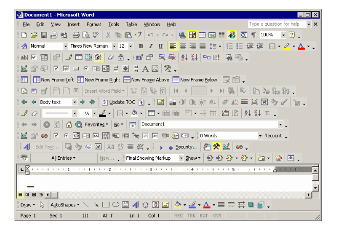
I think Jira has got it’s UI/UX completely wrong, it reminds me of Mircosoft word
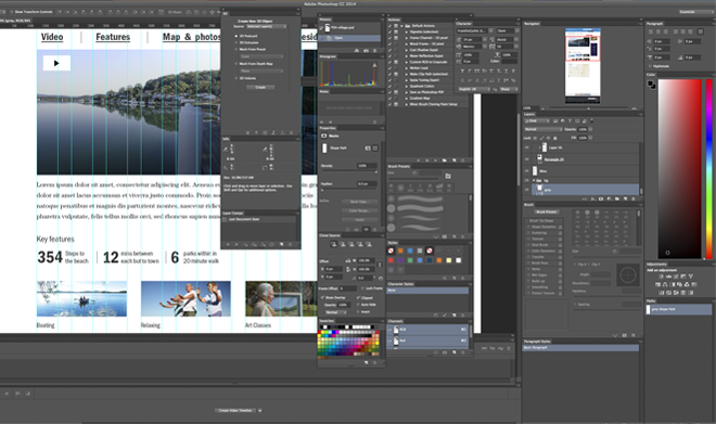
Jira can simplify its IU/UX by removing/hiding non essential sections and giving the user the base and let the user add in sections when they need it according to their level of knowledge. Lets look at photoshop as an example, you can open windows that are essential to your work. Just imagine if photoshop was like Jira and all the options were open, it would be a mess!
“Because in reality, the problem isn't how to make the world more technological. It's about how to make it more humane again. And if anything” John Maeda
So what is the point of this blog? Well nothing really, I’m just venting my frustration with a software that is built for people like me who are supposed to simplify designs but find themselves using a program with so many complexities and a convoluted user interface with far too many options.


