


Imaginative ways to implement navigation
Clarks footwear recently ran an in-house test looking at four variants.
One in test in particular was very interesting; Clarks tested the use of a sticky-navigation menu when scrolling back up the page – while the navigation menu was hidden when scrolling down the page, maximising screen real-estate space.
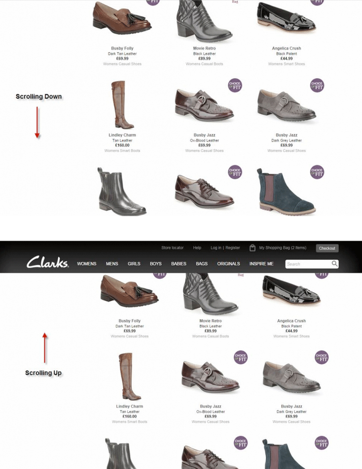
This is a brilliant idea; we can assume that when users scroll down a page, they are only interested in viewing products, or reading content, so why waste precious space?!
Logically we can assume that when users decide to scroll back up the page, they are looking to achieve one of a few things; change product categories, find additional content, or go to checkout - lets provide users with a seamless call to action and increase conversion rates.
Clarks definitely hit the jackpot with this cool interaction, which saw some great results:
-Increased orders by 2.16% at a 96.5% confidence level.
-Increased ‘Add to Basket’ clicks by 1.27% at a 92% confidence level.
-Additionally, navigation interaction increased by 9.11% at a 99.9% confidence rate.
Great idea right? and simple to implement. Go Clarks!!


