

Did I do something wrong?
So what is a 404?
When you receive a 404 error it means that the page you are trying to reach is not available or a dead link. If you went to any site and tried to access a page that didn’t exist like http://wiliam.com.au/banana you would receive a 404. It’s more common than you think, if you were to unpublish a page on your website and a user tried to go back with an existing link they would receive this error.
Now for people who work in the industry, we understand what a 404 means and that it’s not a scary error. But for the average user of your site they probably won’t know what a 404 means. It’s a front-end error that your users will see. Not your developers. Therefore you need to make it as user friendly as possible.
I’m just trying to imagine what my Mum would think if she reached a 404 error. Firstly she probably would be one of the people typing in a link incorrectly, maybe by being distracted by the 27 toolbars on her Internet Explorer only allowing her to see 10 pixels worth of screen space. If she reached a 404 she’d think she broke the interwebs. Therefore you need to make sure that it’s a friendly error and doesn’t cause users to think they’ve hit a roadblock or done something wrong causing them to give up.
Here’s what a 404 looks like with no styling:
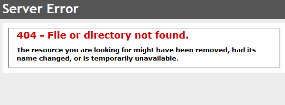
Eugh.
Nasty.
That is not what you want users to be see.
Style it up and make it friendly!
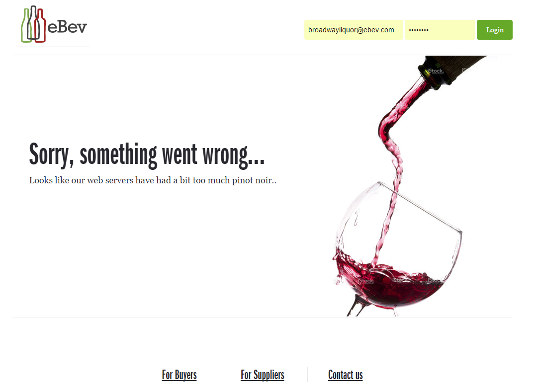
One of our recent launches eBev, implemented a more friendly approach:
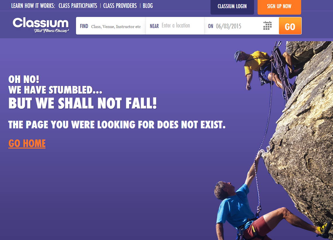
Just like another of our sites Classium:
It doesn’t just stop at friendly language, why not add more features to your 404 to encourage users to get back on the site. One of our previous blogs goes into more detail on ideas and improvements you can make for your 404 on an eCommerce site.
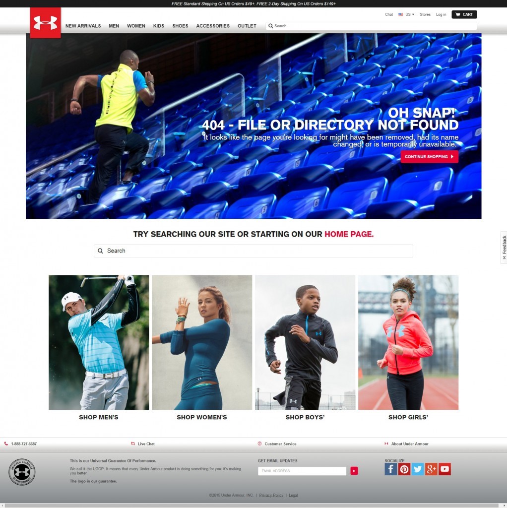
Underarmour provide a site search and a link back to the homepage. Below this are the four modules from the homepage to allow you to start browsing again.
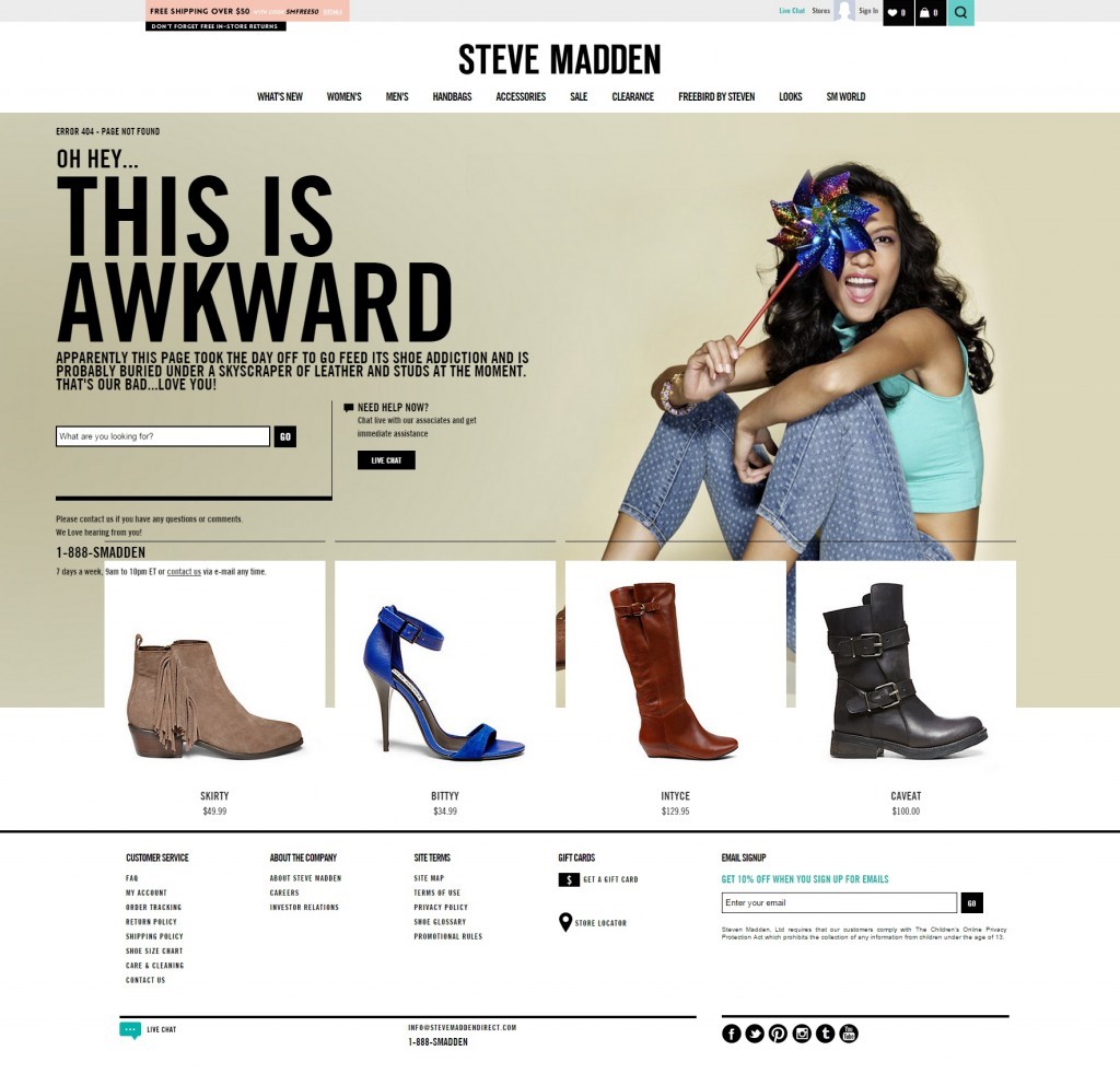
The Steve Madden 404 doesn’t even look like one! If it wasn’t for the ‘Awkward’ text explaining the error I would of thought I had just stumbled onto another page in the site. It provides no interruption and offers not only a Search but a Live Chat. Talk about encouragement.
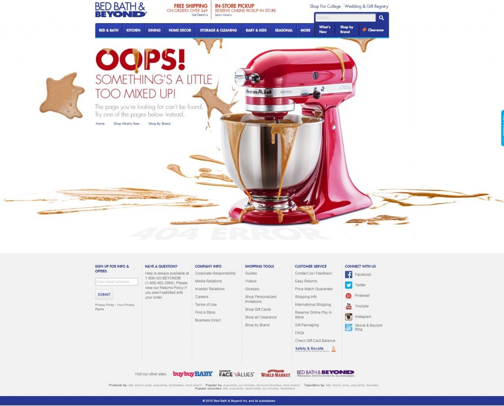
Bed Bath and Beyond make their 404 a bit fun and also provide three links to get the user straight back into the site:
The three main points to take out of this:
- Make your 404 friendly, you don’t ever want the user to think that the site is broken or that they've done something wrong.
- If they didn’t find the page they are looking for they might want to find something similar. Provide a Search bar on the page.
- Provide assistance like a link to Contact or Live Chat. If someone needs help finding something that no longer exists be there to help out.


