


A quick A/B test of landing pages; a client case study
How good is your gut?
We recently tested two completely different and new landing page designs against an existing landing page design for client, carloans.com.au. See which one you think is the winner:
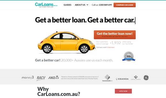
The control (existing landing page design):

Version A (new landing page design 1):
In this design, there was a transition where an older car transitioned into the new yellow car you can see in the design below:
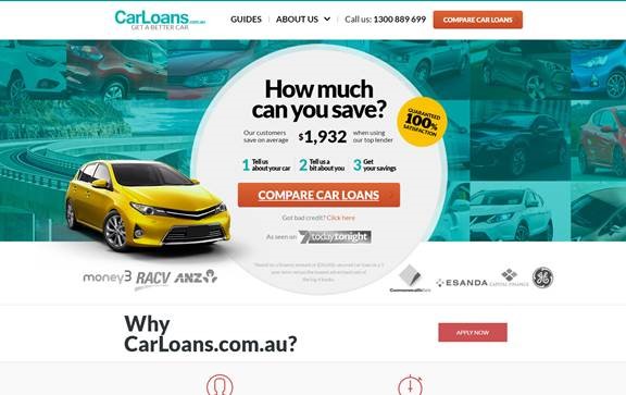
Version B (new landing page design 2):
The results?
Version B had a 68% probability of outperforming the original and Version A had a 0.6% chance. Version B was the winner.
Why? There could be many reasons, maybe the transition was distracting in Version A. I believe it has something to do with the various car photos in Version B, the users are there for a car so it is highlighting the main goal more and perhaps hooking them in. The trust symbols are also higher in Version B and it highlights the "3 steps" more.
This was an exciting case study for one of our very savvy clients who use Google Experiments constantly.


