16 Best Paralax websites – Pros & Cons
Parallax scrolling has been around for years in the world of video games, but it has hit the web with a vengeance. Nike designed the first parallax website in 2011 and it has become increasingly popular since. Some might say it has been overused, but it definitely still has it pace in web design, especially in cases of storytelling.
What is parallax scrolling?
Paralax scroling creates the illusion of depth in a 2D website. Nearby objects are larger and scroll faster than distant objects, so parallax scrolling can be used to define distance.
How does it work?
It uses a variety of different background images that seem to move at different speeds to create an illusion of depth.
Pros:
- Produces movement in the design and creates excitement.
- Allows designers to create innovative stories and experiences in the web.
- Increases the time a user spends on a site.
Cons:
- When overused parallax scrolling can become tacky.
- numerous layers and animation can slow down the site load time. Impatient users may leave your site before it has loaded.
- Not recommended for mobile sites as the animations can be temperamental and will also slow down the load time.
Here are the best examples of parallax scrolling:
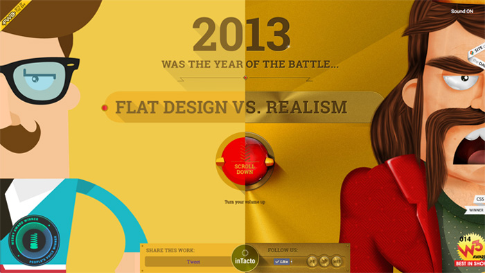
Flat design vs realism
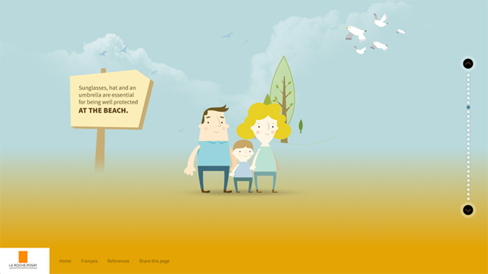
Anthelios
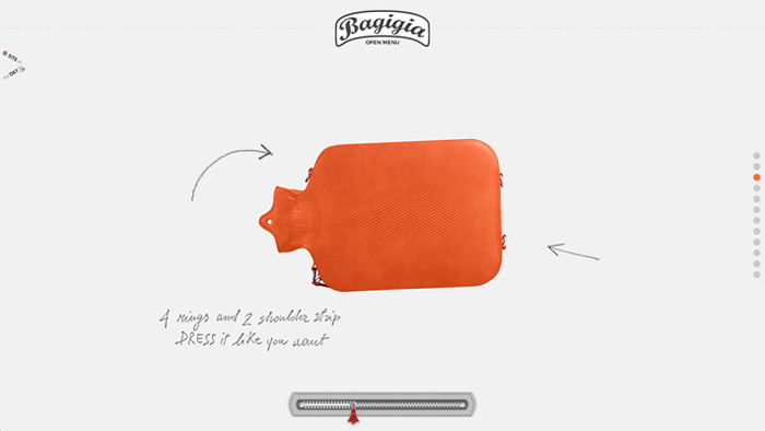
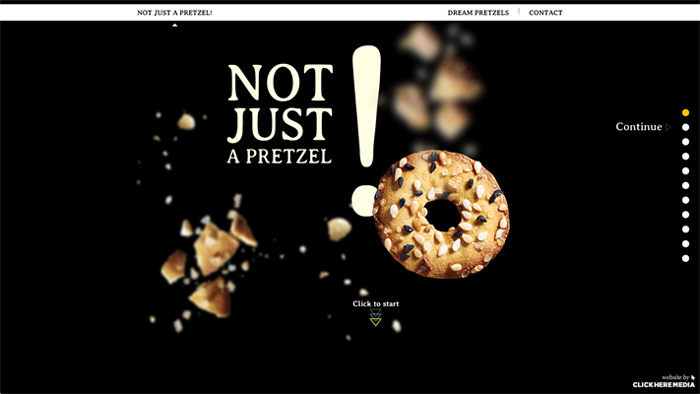
Bagidia
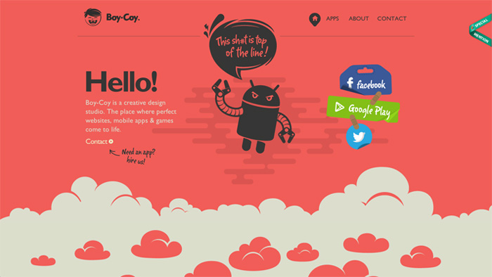
Boy-Coy
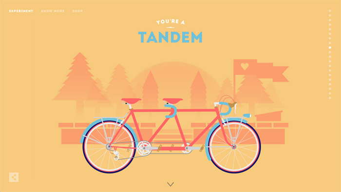
Cyclemon
Express solicitors
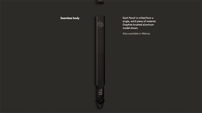
fiftythree
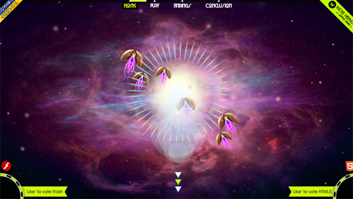
Flash vs HTML
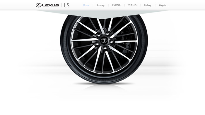
Lexus LS
New York Tmes
Olszanska
Pressels
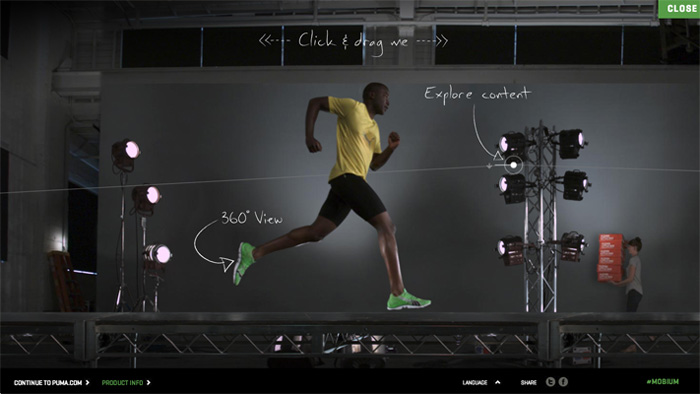
Puma
TEDxGUC
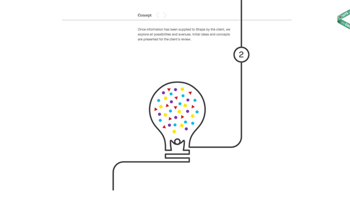
SHAPE